


How to Make a Histogram Chart in Excel
A histogram is a popular analysis tool used in the business world. Similar in appearance to a bar chart, the histogram compresses the data for easy interpretation by grouping the points into ranges or bins. Prior to Excel 2016, creating histograms required the use of the frequency function or the installation of the Analysis ToolPak.
This tutorial will show you how to make and edit a Histogram Chart in Excel
How to Build a Histogram Chart in Excel
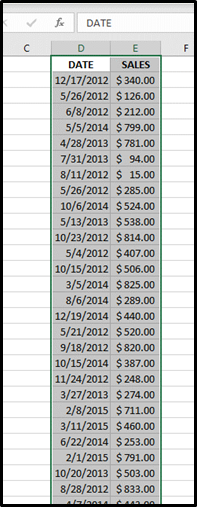
Step 1: Select the data you want displayed in the Histogram chart
Use your mouse to select the data you want included. Excel will use the left most column for the largest groups or branches. The data may need to be reorganized to take advantage of this chart type.
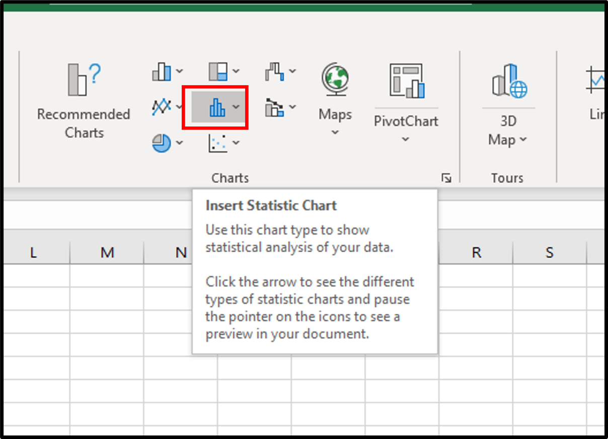
Step 2: Click the Insert Tab, and then Click the Statistic Chart button.
After selecting the data for the chart, click on the Insert tab and select Histogram choice from the charts group.
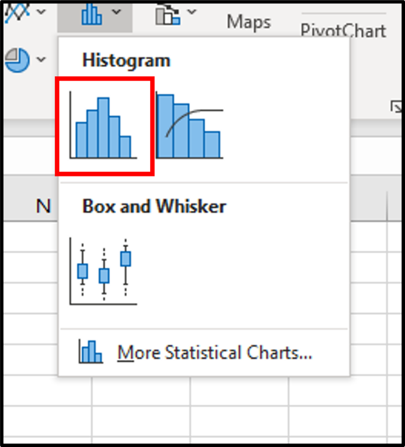
Step 3: Select Histogram chart type.
When the Hierarchy chart type sub menu appears notice the two types: Treemap and Histogram. Treemap is the subject of another tutorial.
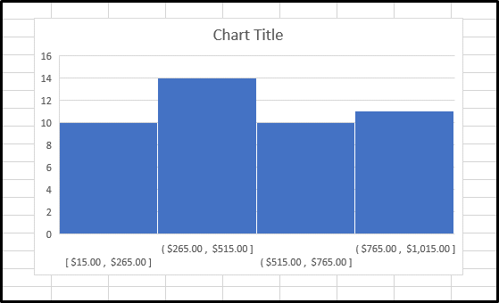
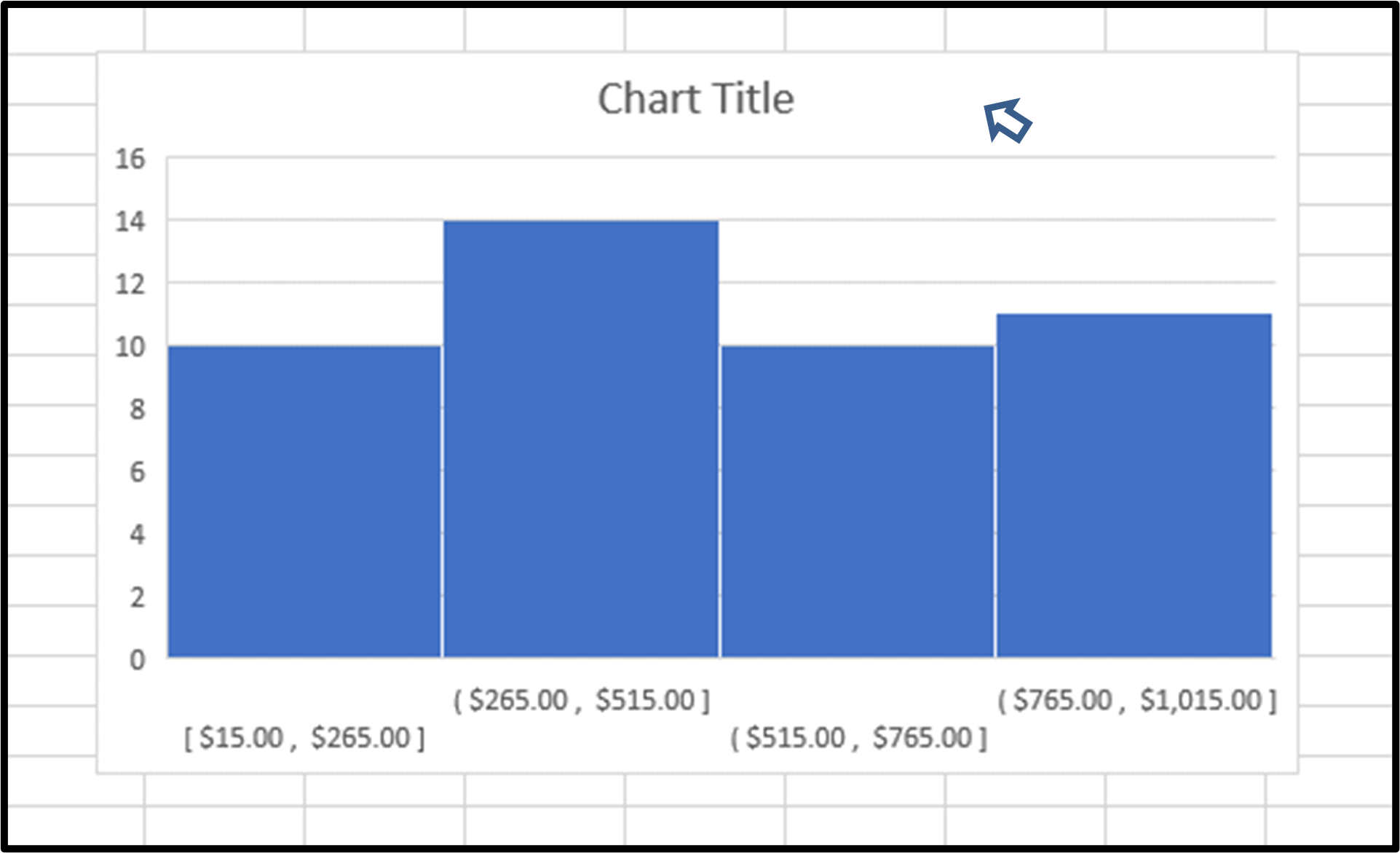
Result: Your Histogram Chart will appear on your worksheet
You will now see your area chart appear in your worksheet. Now you can start adding chart elements and formatting to your chart. Continue reading for more details on adding chart elements and chart formatting.
How to Add Chart Elements to a Histogram chart in Excel
Step 1: Click on a blank area of the chart.
Use the cursor to click on a blank area on your chart. Make sure to click on a blank area in the chart. The border around the entire chart will become highlighted. Once you see the border appear around the chart, then you know the chart editing features are enabled.
Step 2: Click on the Chart Elements button next to the chart
Once the chart name area is highlighted, you will see the Chart Elements button next to upper right hand side of the chart. The button looks like a plus sign. Doing this will open the Chart Elements window.
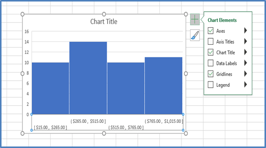
Step 3: Check the Chart Elements you would like to add from the Chart Elements window
Once you have opened the Chart Elements window, you will see a number of items you can select to add to your chart. Check the Chart Elements you would like to display and they will appear on your chart. You can click on the arrow next to each Chart Element option for some additional formatting options.
Here are the available chart elements for a Histogram Chart:
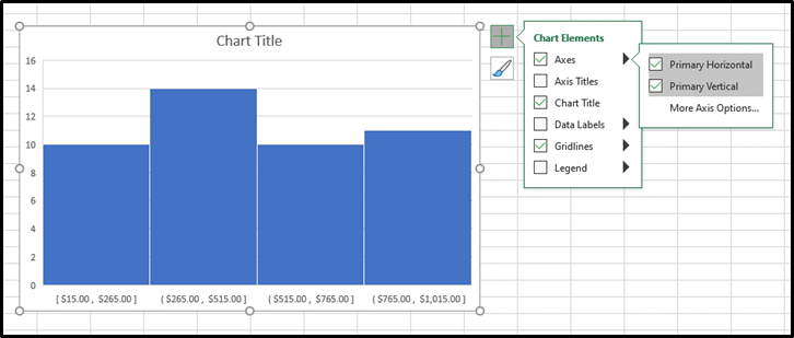
- Axis
- Axis Title
- Chart Title
- Data Labels
- Gridlines
- Legend
Each of these chart elements can be formatted in a variety of ways. Please see our other tutorials on how to add and format each chart element.
How to Format a Histogram chart in Excel
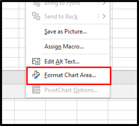
Step 1: Right-Click on a blank area of the chart
Use the mouse to right-click on a blank area on your chart. On the menu that appears select the Format Chart Area option.
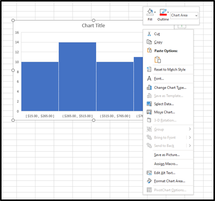
Step 2: Select the Format Chart Area option
On the menu that appears select the Format Chart Area option. Doing this will open the Format Chart Area panel on the right side of the workbook.
Step 3: Use the Format Chart Area panel to make changes to the appearance of your chart
Once you have opened the Format Chart Area panel, you will see a number of items you can modify on your chart. Use these features to create a custom look for your Histogram chart.
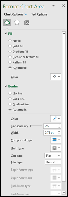
Here are the available chart elements for a Histogram Chart:
- Fill
- Border
- Shadow
- Reflection
- Glow
- Soft Edges
- 3-D Format
- Size
- Properties
Please note: You can also right click on any of your chart elements and open a separate formatting panel for that particular item. The Format Chart Area panel will be the one you want to use when formatting the main structure of the chart.
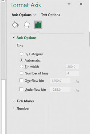
How to Modify the Bins of a Histogram chart in Excel
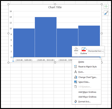
Step 1: Right-Click on the Horizontal Axis of the chart
Use the mouse to right-click on the Horizontal Axis on your chart. On the menu that appears select the Format Axis.
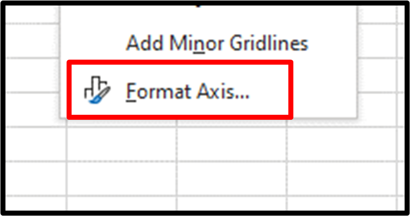
Step 2: Select the Format Axis
On the menu that appears select the Format Axis option.
Step 3: Use the Format Axis panel to make changes to the appearance of your chart
Topic #13
How to Make a Pareto Chart in Excel
Thanks for checking out this tutorial. If you need additional help, you can check out some of our other free Excel Chart tutorials, or consider taking an Excel training class with one of our professional trainers.