


The Ultimate Guide To Excel Charts and Graphs
Creating Chart or Graphs in Excel is one of the key topics many of our students want to learn how to do. Being able to create insightful visuals based on your business data is an essential skillset for many Excel users.
We decided to put together a complete set of tutorials from excerpts of our Excel Charts, Formatting and Reporting class and offer it to you at no charge.
The lessons are pulled straight from our live instructor Excel courses, and are the same topics we cover during our live classes.
Once, you learn the basics about creating charts in Excel, you will be able to use your spreadsheet data to visually communicate business trends and information to your team and to clients. When presented effectively, charts can be an extremely powerful tool when analyzing your business data.
This Ultimate guide to Excel Charts and Graphs is set up so you can learn how to create, edit and publish charts in step-by-step format. Students can go through the lessons in order, or hop to a topic that you want to focus on. There are practice files mentioned in most of the training videos that can be downloaded here.
This is a core skill in Excel, and once you learn it, you will be glad you did. So, let’s get started…
If you use Google Sheets instead of Excel check out our Ultimate Guide To Google Sheets Charts and Graphs.
How to Build a Chart In Excel - Key Steps
The first part of the guide will show you all the key steps required to build a Chart in Excel. Second part will cover detailed tutorials on how to make detailed
If you have never built a chart or graph in Excel, this is the place you will want to start.
The Main Steps in Creating an Excel Chart are:
- Selecting the data to include your chart
- Selecting the Chart Type you want to use
- Editing your Chart Design
- Editing your Chart Formatting
- Exporting your Chart
Click here to view the full tutorial on Excel Chart Building Basics
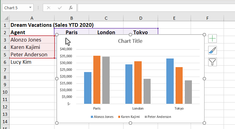
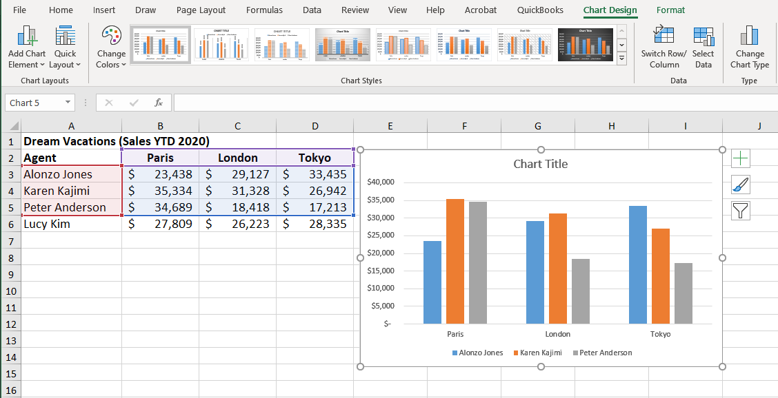
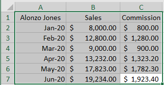
Step 1: Select the Data to use in the Chart
The first step when building any Excel chart is to select the data to use in the chart or graph.
Charts can compare two or more sets of data from your Excel spreadsheet, depending on the information you would like to communicate within your chart.
Once you have identified your data points, you can select that data to include in your chart.
Use the cursor to highlight the cells that contain the data you want to include in your chart. The cells that are selected will be highlighted with a green border.
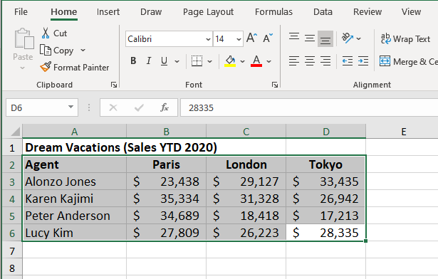
After the data is selected, you can move on to the next step and select your chart type.
Step 2: Select the Chart Type
Excel offers a wide variety of Chart Types for you to use to display your information.
You can communicate how you present your data differently, depending on the chart type that you use.
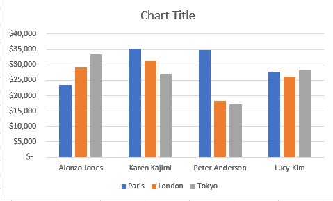
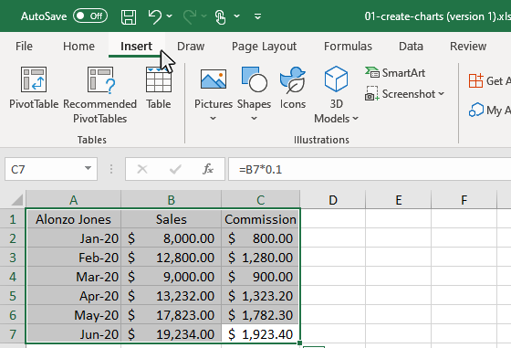
Once, you have selected your data, click the Insert tab and then click the Recommended Charts Button in the Charts Group on the ribbon. You will see a variety of chart types to choose from. Click OK and the chart will appear in the workbook.
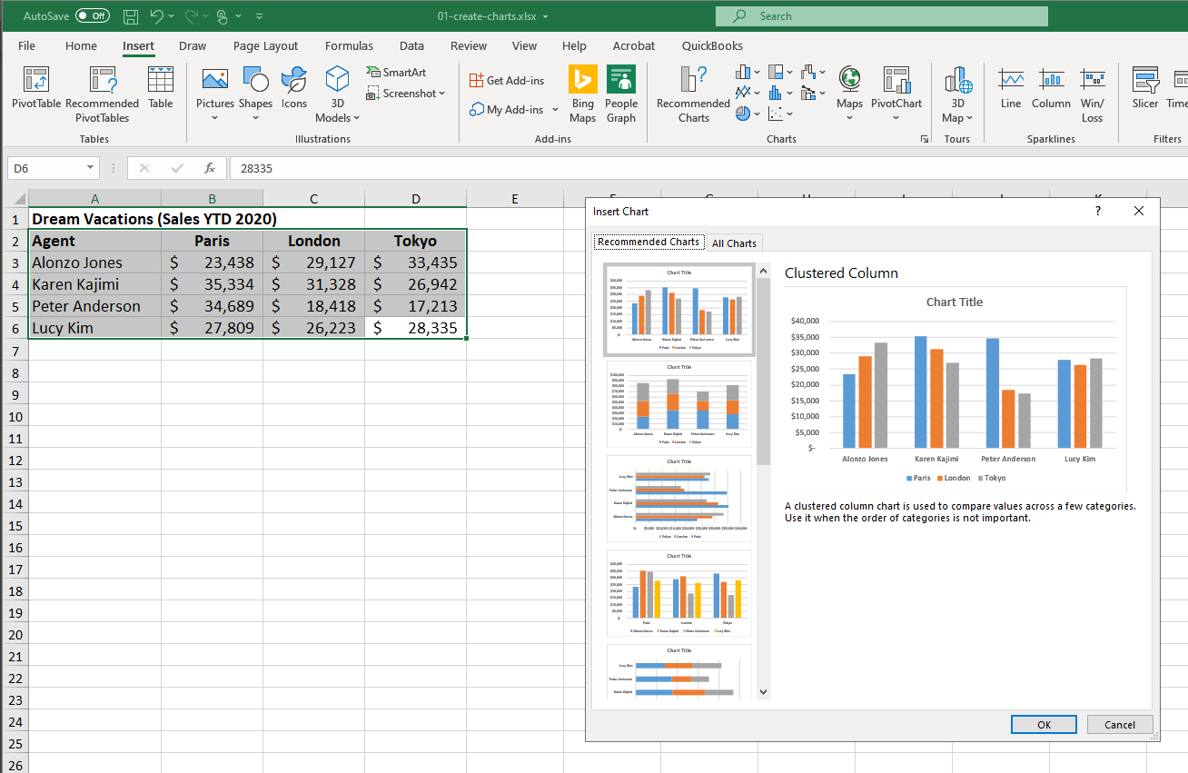
In the Charts Group on the ribbon there are also shortcuts to the most poplular chart types. You can also use these buttons to change the chart type at any time.
Sub-topic - How to Change the Chart Type In Excel
Topics covered will include:
- Changing the Chart Type from the Ribbon
- Changing the Chart Type from the Right Click Menu
Click here to view the full tutorial on How to Change the Chart Type In Excel
Sub-topic - Available Chart Types In Excel
Microsoft Excel currently offers 17 different chart types available to use.
Each chart type has a specific look and purpose.
We have tutorials available on each of these different chart types for you explore:
Clustered Column Chart
Line Graph
Pie Chart
Clustered Bar Chart
Area Chart
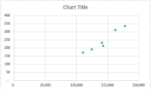
Scatter Chart
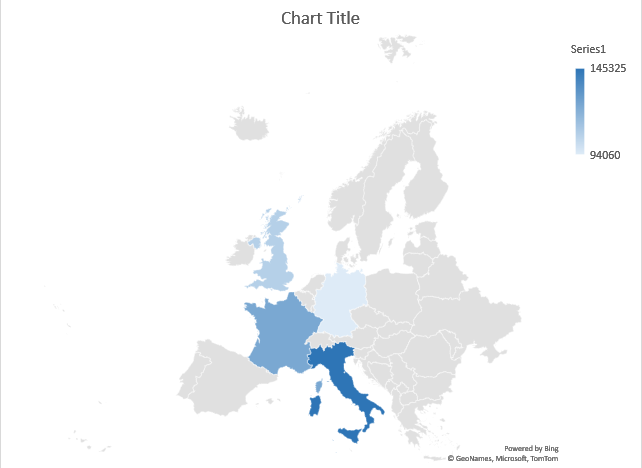
Filled Map Chart
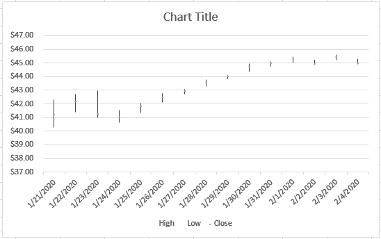
Stock Chart
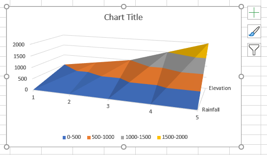
Surface Chart
Radar Chart
Treemap Chart
Sunburst Chart
Histogram Chart
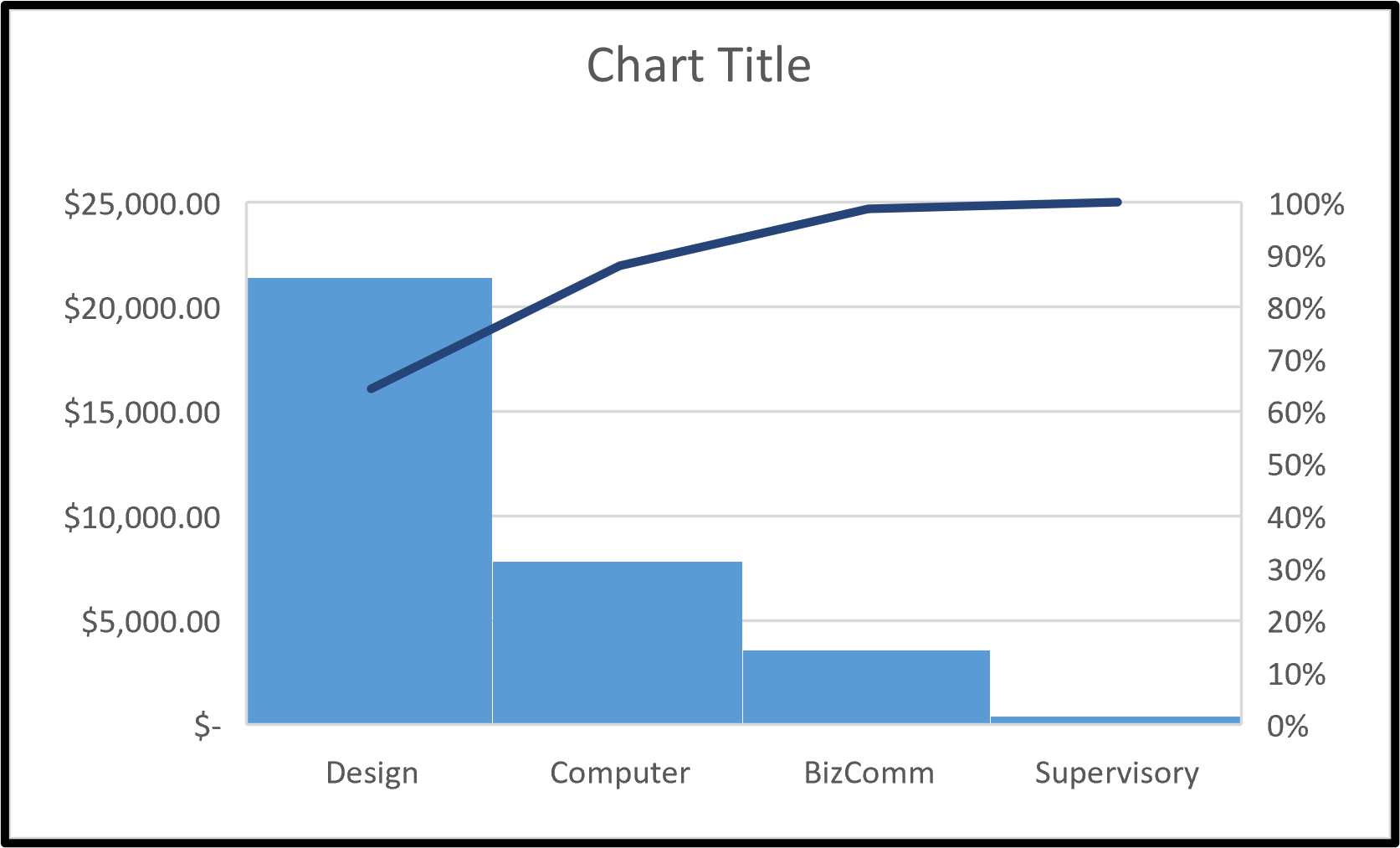
Pareto Chart
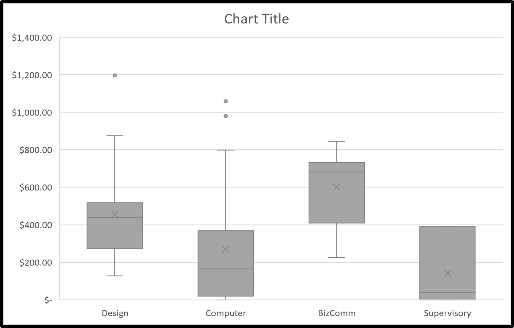
Box and Whisker Chart
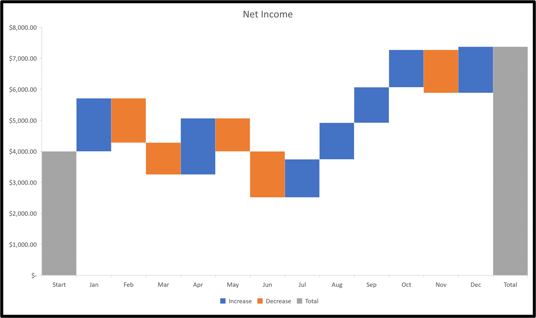
Waterfall Chart
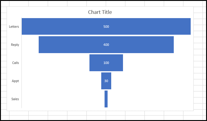
Funnel Chart
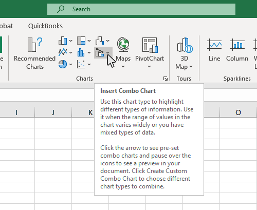
Combo Chart
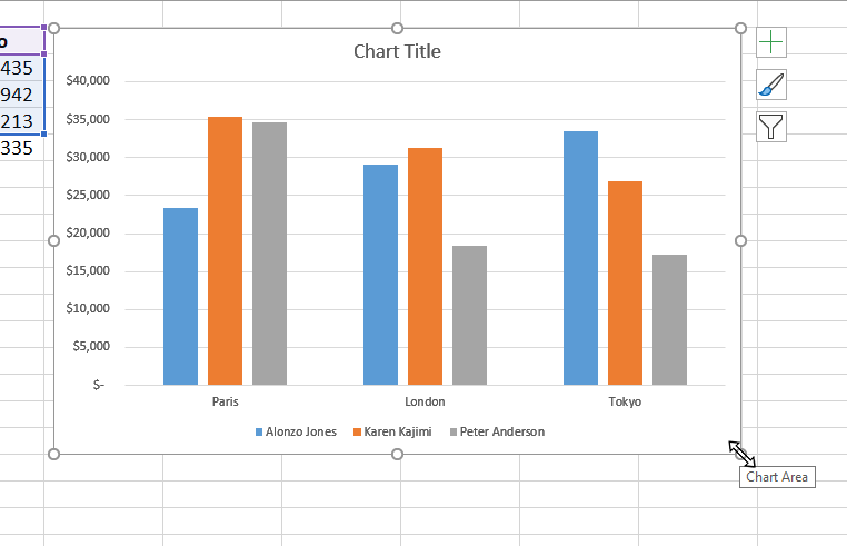
A clustered column chart, or column chart, is used to display a series of two or more data sets in vertical clustered columns. The vertical columns are grouped together, because each data set shares the same axis labels. Clustered Columns are beneficial in directly comparing data sets.
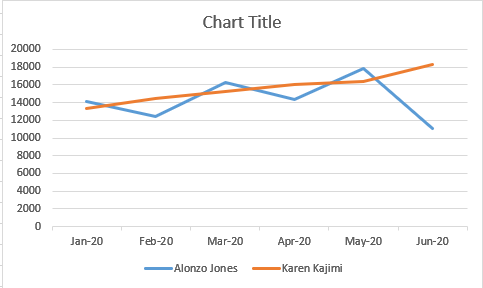
A Line Graph, or line chart, is used to display trends in data over time, by connecting data points using straight lines. Line graphs can compare data over time for one or more groups, and can be used to measure changes over long or short periods of time.
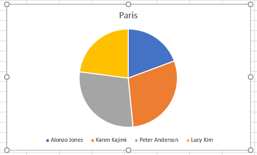
A Pie chart, or Pie Graphs, are used to display information as a percentage of a whole. The the entire Pie represents 100% of the value you are measuring and the data points are a piece, or percentage of that pie. Pies charts are beneficial when visualizing how much each data point contributes to the entire data set.
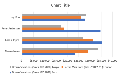
A clustered Bar chart, or Bar chart, is used to display a series of two or more data sets in horizontal clustered Bars. The horizontal bars are grouped together, because each data set shares the same axis labels. Clustered Bars are beneficial in directly comparing data sets.
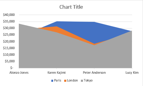
An Area chart, or area graph, is line chart with the area filled in below each line with a color code for each data set.
A Scatter chart, or Scatter Plot, is used to display two or more sets of data to look for correlation and trends between the sets of data values. Scatters plots are useful in identifying trends in data sets, and establishing the strength of correlation between values in those data sets.
A Filled Map chart, is used to display high-level chart data within a map. Filled Maps are beneficial in visually displaying data sets by geographic location. This map type currently has significant limitations on the type of information it can display.
A Stock chart, or stock graph, is used to display the trend of a stock's price over time. Some of the values that can be used in these charts are Opening Price, Closing Price, High, Low, and Volume. Stocks charts are beneficial in visualizing stock price trends and volatility over time.
A Surface chart, or Surface chart, is used to display a series of two or more data sets in vertical Surfaces. The vertical Surfaces are grouped together, because each data set shares the same axis labels. Surfaces are beneficial in directly comparing data sets.
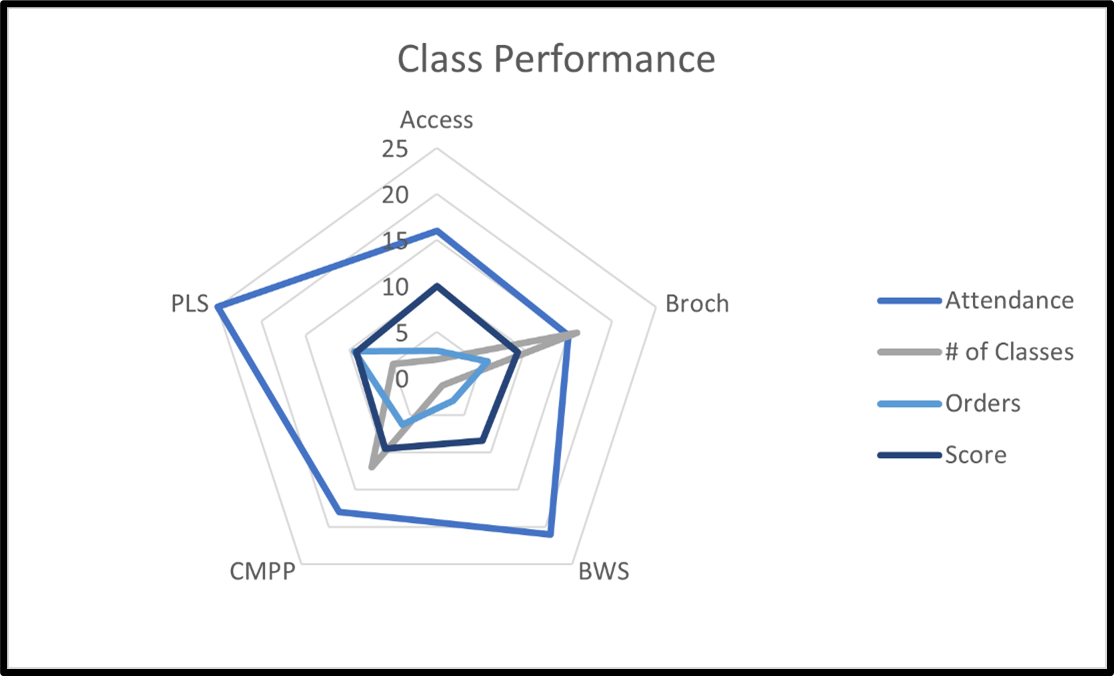
A radar chart (also known as a spider chart) are used to plot one or more groups of values over multiple common variables. They are useful when you cannot directly compare the variables and is especially great for visualizing performance analysis or survey data.
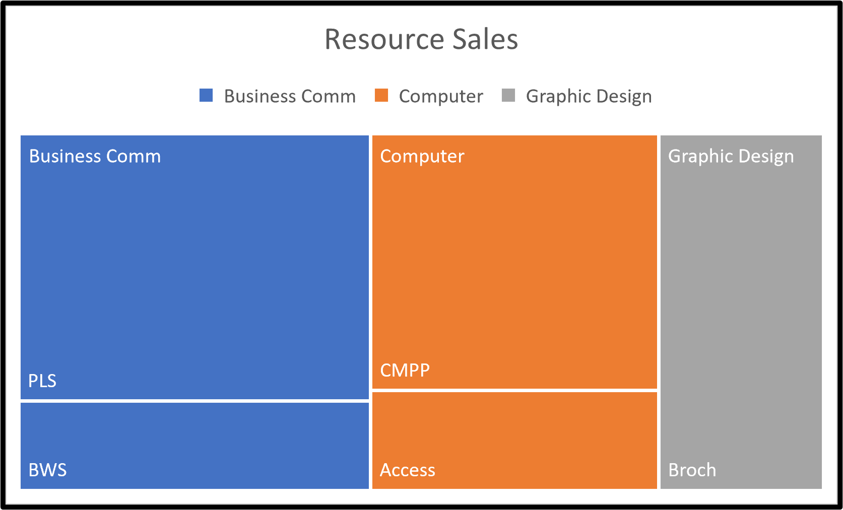
The Treemap chart is a type of data visualization that provides a hierarchical view of the data, making easier to spot patterns. On a treemap, each item or branch is represented by a rectangular shape, smaller rectangles represent the sub-groups or sub-branches.
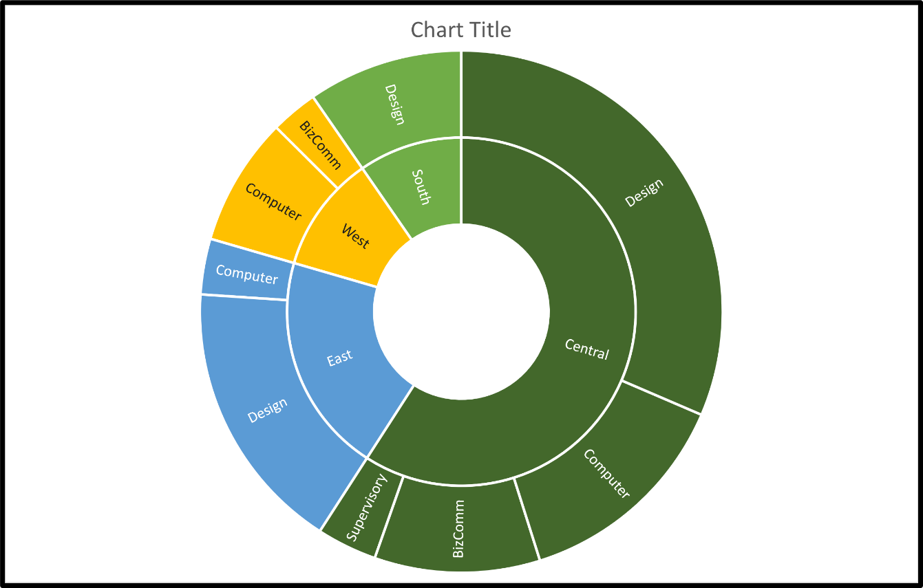
A Sunburst chart is a type of data visualization that provides a hierarchical view of the data, making easier to spot patterns. On a Sunburst, each category is presented in a circular fashion. Each ring represents a level in the hierarchy, with the highest level as the inner most ring. The outer rings plot the sub-categories.
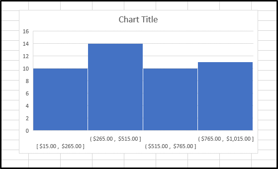
A histogram is a popular analysis tool used in the business world. Similar in appearance to a bar chart, the histogram compresses the data for easy interpretation by grouping the points into ranges or bins.
A Pareto chart is a type of chart that contains both bars and a line graph, where individual values are represented in descending order by bars, and the cumulative total is represented by the line.
A Box and Whisker chart is a statistical chart that graphically depicts numerical data through their statistical quartiles (minimum, first quartile, median, third quartile and maximum).
A Waterfall chart, sometimes called a bridge chart, shows the running totals of values being added or subtracted from the initial value. Examples include net income or the value of a stock portfolio each over time.
A Funnel chart is part of the Excel hierarchical chart family. Funnel Charts are frequently used in business or sales operations showing values from one stage to another. Funnel charts require one category and one value. Best practices suggest a minimum of three stages.
A Combo chart uses two different Excel chart types in one chart. They are used to display two different data sets about the same subject matter.
Click here to view the full tutorial on What Types of Chart Does Excel Offer?
Step 3: Formatting the Appearace of your Chart
Excel offers a number of options for you to customize the appearance of your chart.
You have a great degree of flixibilty in editing the appearance of your chart to make it visually appealing and to communicate your data effectively.
Topics covered will include:
- Positioning the Chart on the Worksheet
- Add a Title to a Chart
- Resizing the Chart
- Changing the Colors of Chart Elements
- Changing the Style of Chart Elements
- Changing the Chart Fonts and Font Sizes
- Add a Legend to a Chart
- Add a Gridlines to a Chart
- Add a Axis Lables to a Chart
- Creating a Reusable Chart Template
Here are links to the full tutorials on formatting the appearance of your charts:
- How to Move and Resize Charts in Excel
- How to Add a Title to a Chart in Excel
- How to Add a Legend to a Chart in Excel
- How to Add and Remove Gridlines in Excel
- How to Add Axis Labels to a Chart in Excel
Step 4: Formatting the Data on your Chart
Excel offers a number of options for you to customize the data displayed on your chart.
The ability to manipulate the display of data on your charts will give you the flexibilty needed to communicate your data effectively.
Topics covered will include:
- Adding Data Tables
- Filtering Chart Data
- Adding Trendlines to Data
- Building Dual Axis Charts
- Creating Sparklines
Here are links to the full tutorials on formatting the appearance of your charts:
- How to Make Data Tables in Excel
- How to Filter Charts in Excel
- How to Make Trendlines in Excel Charts
- How to Make Dual Axis Charts in Excel
- How to Create Sparklines in Excel
Step 5: Exporting your Chart
Now that you have completed your chart, you may want to export it to a different document or print the chart.
We will look a the various options for exporting your Excel charts.
Topics covered will include:
- Saving a Chart as an Image
- Saving a Chart as a PDF
- Inserting and Excel Chart into Microsoft Word
- Inserting and Excel Chart into Microsoft PowerPoint
Here are links to the full tutorials on formatting the appearance of your charts:
- How to Make Data Tables in Excel
- How to Filter Charts in Excel
- How to Make Trendlines in Excel Charts
- How to Make Dual Axis Charts in Excel
- How to Create Sparklines in Excel
If there are any topics that you think would be useful to add to this guide, please feel free to contact us. Your feedback is always appreciated.
How to Change the Chart Type in Excel
Step 1: Click on a blank area of the chart
Use the cursor to click on a blank area on your chart. Make sure to click on a blank area in the chart. The border around the entire chart will become highlighted. Once you see the border appear around the chart, then you know it is ready to be changed.
Step 2: Select the Chart Design tab
After you have selected your chart, the Chart Design tab will appear on the ribbon. This tab will only appear when a chart is selected. Options included in this tab are Chart Layouts, Chart Styles, Data, Type and Location.
Step 3: Click the Change Chart Type Button
The Change Chart Type button is in the Type section of the Chart Design tab. Click on the Change Chart type button and a pop-up menu will appear with all the Chart Type options available.
Alternate method: When the chart is selected, right click the mouse and select the Change Chart Type option.
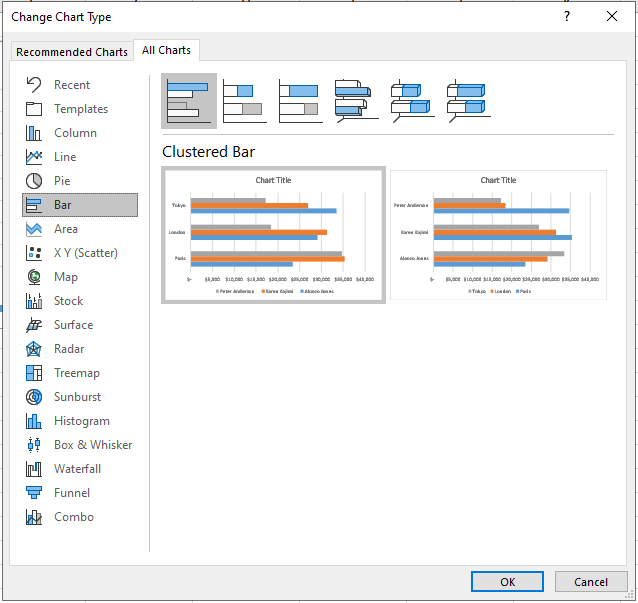
Step 4: Select the Chart Type you would like to use from the Change Chart Type screen
Now that you see the Change Chart Type screen you can select any of the available options. You can preview how the various chart types will look and select the appropriate chart for your data. Excel provides a Recommended Charts and All Chart tabs on this screen. Once you select your chart type, click OK, and your chart will change to the one you picked.
How to Move and Resize Charts in Excel
After creating your chart in Excel, you may want to change the size of the chart, move it to a different spot on the worksheet, or move it to a different worksheet. This tutorial will teach you how to move and resize charts and graphs in Excel.
How to Move a Chart in Excel
Step 1: Click on a blank area of the chart
Use the cursor to click on a blank area on your chart. Make sure to click on a blank area in the chart. The border around the entire chart will become highlighted. Once you see the border appear around the chart, then you know it is ready to be moved.
Step 2: Move the chart to the desired location
You can use your mouse to drag the selected chart to the location you want on the spreadsheet. Once you have placed the chart in the correct location, click a blank cell in the spreadsheet and the chart will be de-selected.
Alternate Method: An alternate method for moving the chart to a specific location is to use the arrow keys on your keyboard to move and reposition the chart.
How to Resize a Chart In Excel
Step 1: Click on a blank area of the chart
Select the chart you want to resize, and make sure the circular move handles appear on the border around the chart.
Step 2: Use the Move handles to resize the chart
The circular move handles on the border of the chart allow you to resize the entire chart, or to make horizontal and vertical changes to the size of the chart. To change the size of the whole chart, mouse over one of the move handles on the corner of the chart and drag it out to make it larger, or drag it in to make it smaller. When you see the mouse pointer change to the double arrow
Top make horizonal or vertical changes to the chart size, use the move handles on the top, bottom or sides of the chart to make the appropriate changes.
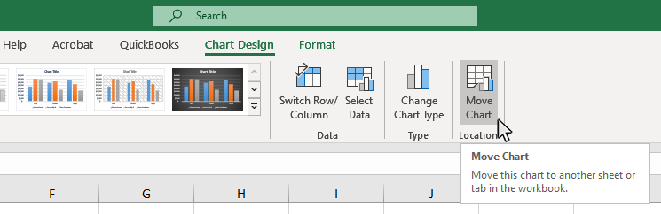
How to Move a Chart to a New Worksheet in Excel
Sometimes, you will not want to display your chart on the same worksheet as the chart's source data and have it display on its own tab. To do this, complete the following steps:
Step 1: Click on a blank area of the chart
Use the cursor to click on a blank area on your chart. Make sure to click on a blank area in the chart. The border around the entire chart will become highlighted. Once you see the border appear around the chart, then you know it is ready to be changed.
Step 2: Select the Chart Design tab
After you have selected your chart, the Chart Design tab will appear on the ribbon. This tab will only appear when a chart is selected. Options included in this tab are Chart Layouts, Chart Styles, Data, Type and Location.
Step 3: Click the Move Chart Button
The Move Chart button is in the Location section of the Chart Design tab. Click on the Move Chart button and a pop-up menu will appear with all the Move Chart options available.
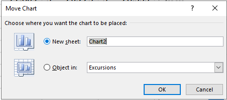
Step 4: Select the New Sheet Option on the Move Chart pop-up window
The final step is to select the New Sheet option on the Move Chart pop-up window. Once you select this option and hit OK the chart will appear on its own worksheet and no longer display on the original sheet. Changes to the chart data will still effect the appearance of the chart even if they are not on the same page.
How to Change the Chart Style in Excel
When creating a chart in Excel, you will often want to change the style of chart you are using to more effectively display the information you are presenting. Excel offers a variety of chart styles for you to use. This tutorial will teach you how to change the style of the chart you are using in Excel.
Step 1: Click on a blank area of the chart
Use the cursor to click on a blank area on your chart. Make sure to click on a blank area in the chart. The border around the entire chart will become highlighted. Once you see the border appear around the chart, then you know it is ready to be changed.
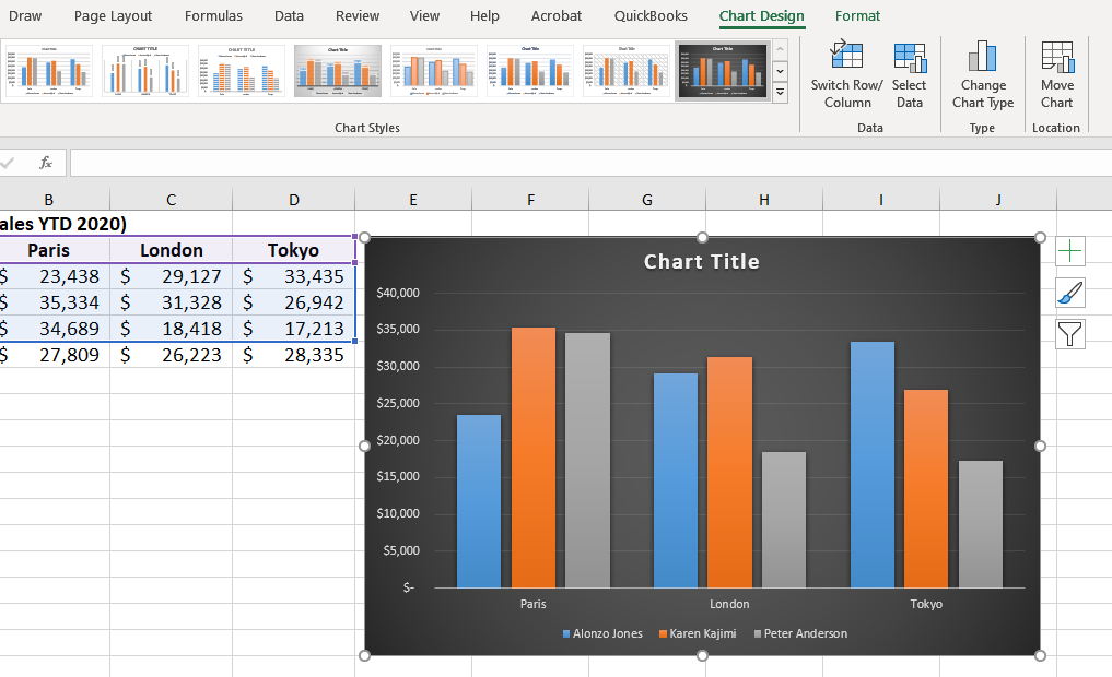
Step 2: Select the Chart Design tab
After you have selected your chart, the Chart Design tab will appear on the ribbon. This tab will only appear when a chart is selected. Options included in this tab are Chart Layouts, Chart Styles, Data, Style and Location.
Step 3: Select a Style from the Chart Styles section on the Design Tab
You can now see the available styles for the chart type you have selected. Mouse over the different chart styles to see a preview of how your chart with look with that particular style.
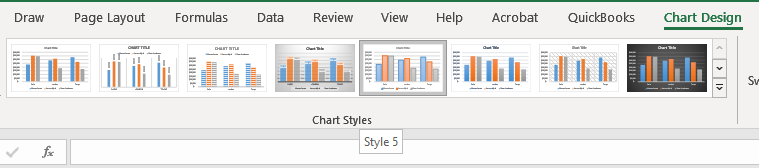
Once you identify the style you want, click on the button for that style and it will apply the change to your chart.
How to Add a Title to a Chart in Excel
When creating a chart in Excel, you will normally want to add a title to your chart so the users better undertand the information contained in the chart. This tutorial will teach you how to add and format a title on your Excel chart.
Step 1: Click on a Chart Title
Use the cursor to click on a the "Chart Title" text on your chart. The border around the chart title area will become highlighted. Once you see the border appear around the chart, then you know it is ready to be changed.
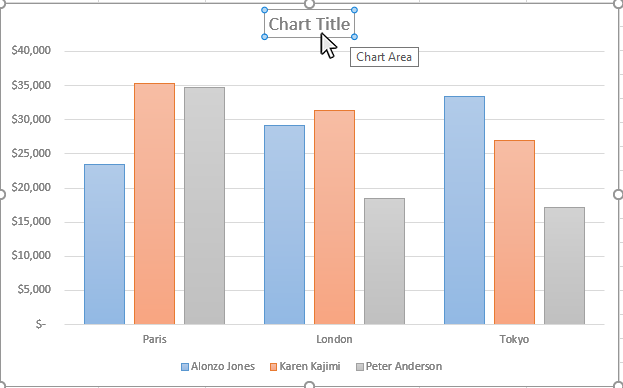
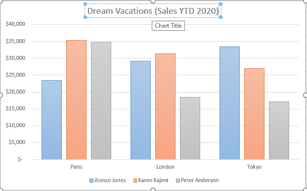
Step 2: Type in the Name of the Chart
Once the chart name area is highlighted, you can type in the name of the chart. If you are happy with the look of the chart title, just click on a different part of the chart or worksheet and you will be done. If you want to do additional formatting to the chart, the next steps will show you how to do this.
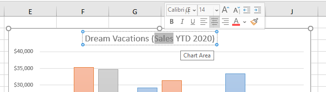
Step 3: Format the Chart Title
There are a number of options to format your chart title. To access the formatting tools, double-click the chart title area on your chart. You are able to format your chart title in the following ways:
- Resize the Chart Title Area
- Reposition the Chart Title Area
- Change the Font Type
- Change the Font Size
- Change the Font Color
- Format the Chart Font (Bold, Italics, Underline)
- Change the Fonty Alignment (Left, Center, Right)
How to Add a Legend to a Chart in Excel
When creating a chart in Excel, you may want to add a legend to your chart so the users better undertand the information contained in the chart. This tutorial will teach you how to add and format a legend on your Excel chart.
Step 1: Click on a blank area of the chart
Use the cursor to click on a blank area on your chart. Make sure to click on a blank area in the chart. The border around the entire chart will become highlighted. Once you see the border appear around the chart, then you know it is ready to be changed.
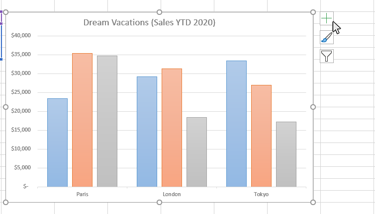
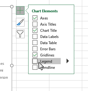
Step 2: Click on the Chart Elements button next to the chart
Once the chart name area is highlighted, you will see the Chart Elements button next to upper right hand side of the chart. The button looks like a plus sign. Doing this will open the Chart Elements window.
Step 3: Select Legend from the Chart Elements window
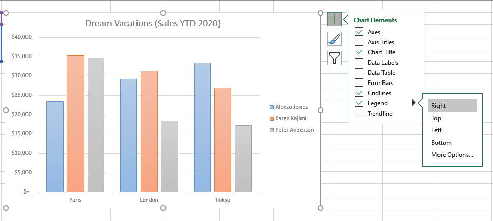
Once you have opened the Chart Elements window, you will see a number of items you can select to add to your chart. Check the Legend option on the Chart Elemnts window and a Legend will appear on your chart. You can click on the arrow next to the Legend for some additional placement options for the legend.
Step 4: Position the Legend on your Chart
Once you have turn on the Legend option, you can place the legend at various positions on the chart. Click on the arrow to the right of the Legend checkbox on the Chart Elements window and you will see options for the legend placement on the chart. You are able to position your chart Legend in the following ways:
- Right
- Left
- Top
- Bottom
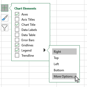
Step 5: Format your Chart Legend
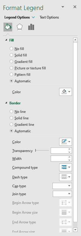
You can open the Format Legend panel to access a number of formatting options for your chart Legend. Click on the arrow to the right of the Legend checkbox on the Chart Elements window and you will see the "More Options" button. Click on this button and the Format Legend panel will appear.
This is a list of some of the Legend formatting options available on the Format Legend panel:
- Legend Fill
- Legend Borders
- Legend Shadow
- Legend Glow
- Legend Soft Edges
- Text Fill
- Text Outline
- Text Shadow
- Text Glow
- Text Soft Edges
- Text Box Formatting
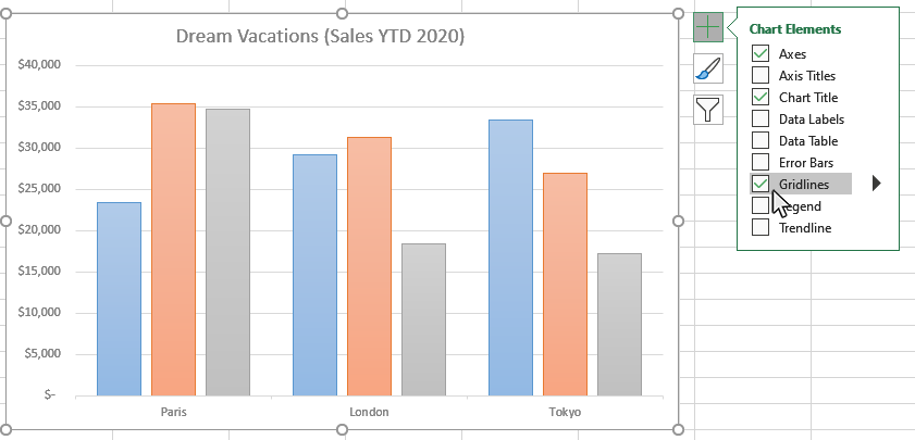
How to Add and Remove Gridlines in Excel
When creating a chart in Excel, you may want to add a gridlines to your chart so the users better undertand the information contained in the chart. This tutorial will teach you how to add and format gridlines on your Excel chart.
Step 1: Click on a blank area of the chart
Use the cursor to click on a blank area on your chart. Make sure to click on a blank area in the chart. The border around the entire chart will become highlighted. Once you see the border appear around the chart, then you know it is ready to be changed.

Step 2: Click on the Add Chart Elements button next to the chart
Once the chart name area is highlighted, you will see the Chart Elements button next to upper right hand side of the chart. The button looks like a plus sign. Doing this will open the Add Chart Elements window.

Step 3: Select Gridlines from the Chart Elements window
Once you have opened the Chart Elements window, you will see a number of items you can select to add to your chart. Check the Gridlines option on the Chart Elements window and Gridlines will appear on your chart. You can click on the arrow next to the Gridlines option for some additional gridline formatting options.
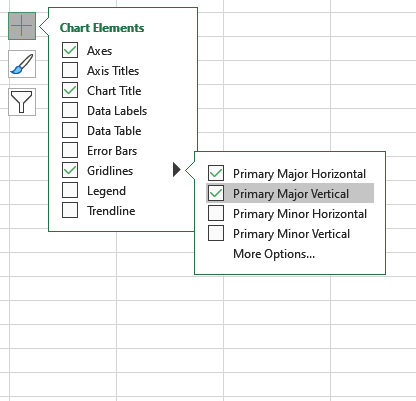
Step 4: Select the type of gridlines you want to appear on your chart
Once you have turn on the Gridlines option, you activate different gridline types on the chart. Click on the arrow to the right of the Gridline checkbox on the Chart Elements window and you will see options for the Gridline Types for your chart. You are able to activate the following types of gridlines:
- Primary Major Horizontal
- Primary Major Vertical
- Primary Minor Horizontal
- Primary Minor Vertical
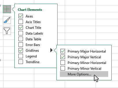
Step 5: Format your Chart Gridlines
You can open the Format Gridlines panel to access a number of formatting options for your chart gridlines. Click on the arrow to the right of the Legend checkbox on the Chart Elements window and you will see the "More Options" button. Click on this button and the Format Gridlines panel will appear on the right side of the worksheet.
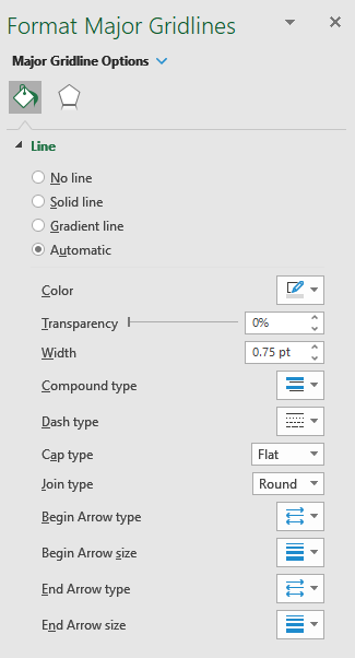
This is a list of some of the Gridline formatting options available on the Format Gridline panel:
- Line
- Shadow
- Glow
- Soft Edges
Step 6: How to Turn off Gridlines
If you want to turn off your gridlines, open the Chart Elements window and uncheck the Gridlines option.
How to Add Axis Labels to a Chart in Excel
When creating a chart in Excel, you may want to add a axis labels to your chart so the users can undertand the information contained in the chart. This tutorial will teach you how to add and format Axis Lables to your Excel chart.
Step 1: Click on a blank area of the chart
Use the cursor to click on a blank area on your chart. Make sure to click on a blank area in the chart. The border around the entire chart will become highlighted. Once you see the border appear around the chart, then you know the chart editing features are enabled.
Step 2: Click on the Chart Elements button next to the chart
Once the chart name area is highlighted, you will see the Chart Elements button next to upper right hand side of the chart. The button looks like a plus sign. Doing this will open the Chart Elements window.
Step 3: Select Axis Titles from the Chart Elements window
Once you have opened the Chart Elements window, you will see a number of items you can select to add to your chart. Check the Axis Titles option on the Chart Elements window and Axis Titles will appear on your chart. You can click on the arrow next to the Axis Titles option for some additional axis title formatting options.
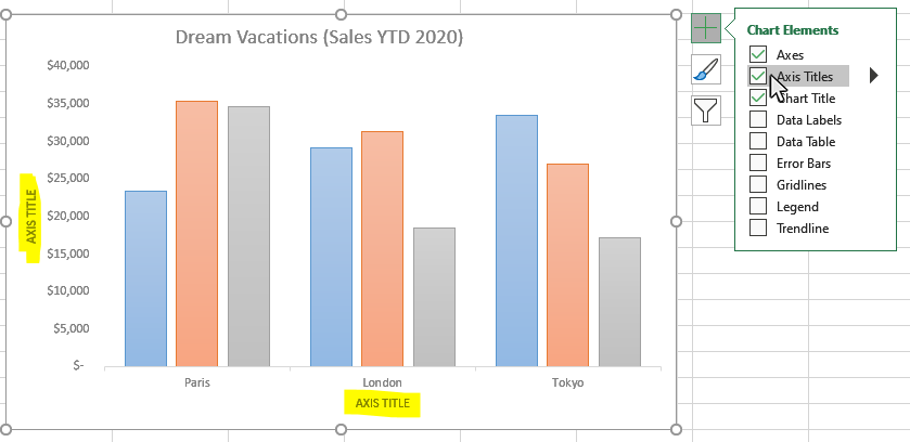
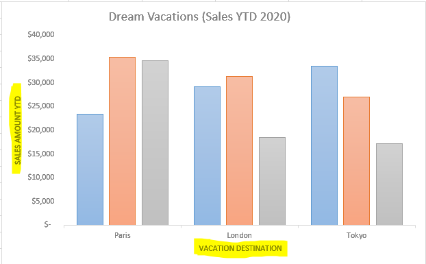
Step 4: Type in the Values for the Axis Titles
Once you have turn on the Axis Titles option, you type in a value for each axis title. Double-Click on the horizontal or vertical axis title and then you can type in an appropriate name for that chart axis.
Step 5: Format your Axis Titles
You can open the Format Axis Titles panel to access a number of formatting options for your chart axis titles. Click on the arrow to the right of the Legend checkbox on the Chart Elements window and you will see the "More Options" button. Click on this button and the Format Axis Titles panel will appear on the right side of the worksheet.

This is a list of some of the Axis Title formatting options available on the Format Axis Titles panel:
- Fill
- Border
- Shadow
- Glow
- Soft Edges
- Alignment
Step 6: How to Turn off Axis Titles
If you want to turn off your axis titles, open the Chart Elements window and uncheck the Axis Titles option. You can also go into the Axis Titles sub-menu and just turn off the horizontal or vertical axis title if you wish, and leave the other one active.
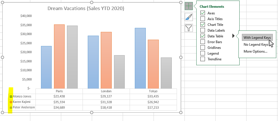
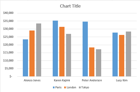
How to Make Data Tables in Excel
When creating a chart in Excel, you may want to add a data table to your chart so the users can see the source data while looking the chart. This tutorial will teach you how to add and format Data Tables in your Excel chart.
Step 1: Click on a blank area of the chart
Use the cursor to click on a blank area on your chart. Make sure to click on a blank area in the chart. The border around the entire chart will become highlighted. Once you see the border appear around the chart, then you know the chart editing features are enabled.
Step 2: Click on the Chart Elements button next to the chart
Once the chart name area is highlighted, you will see the Chart Elements button next to upper right hand side of the chart. The button looks like a plus sign. Doing this will open the Chart Elements window.
Step 3: Select Data Table from the Chart Elements window
Once you have opened the Chart Elements window, you will see a number of items you can select to add to your chart. Check the Data Table option on the Chart Elements window and a Data Table will appear on your chart. You can click on the arrow next to the Data Table option for some additional data table formatting options.

Step 4: Add or Remove Legend Keys to your Data Table
Once you have turned on the Data Tables option, you add or remove legend keys from your table. Click on the arrow next to the Data Table option on the Chart Elements window and you will see the option to turn the Legend Keys on or off.
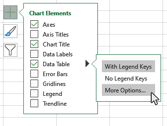
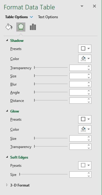
Step 5: Format your Data Table
You can open the Format Data Table panel to access a number of formatting options for your chart Data Table. Click on the arrow to the right of the Legend checkbox on the Chart Elements window and you will see the "More Options" button. Click on this button and the Format Data Tables panel will appear on the right side of the worksheet.
This is a list of some of the Data Table formatting options available on the Format Data Table panel:
- Fill
- Border
- Shadow
- Glow
- Soft Edges
- 3-D Format
- Data Table Borders
Step 6: How to Turn off Data Tables
If you want to turn off your Data Table, open the Chart Elements window and uncheck the Data Table option.
How to Filter Charts in Excel
Once you have created a chart in Excel, you may want to filter the information that is visible on your chart to focus on specific details or data points. This tutorial will teach you how to filter your Excel chart.
Step 1: Click on a blank area of the chart
Use the cursor to click on a blank area on your chart. Make sure to click on a blank area in the chart. The border around the entire chart will become highlighted. Once you see the border appear around the chart, then you know the chart editing features are enabled.
Step 2: Click on the Chart Filters button next to the chart
Once the chart name area is highlighted, you will see the Chart Filters button next to upper right hand side of the chart. The button looks like a funnel. Doing this will open the Chart Filters window.
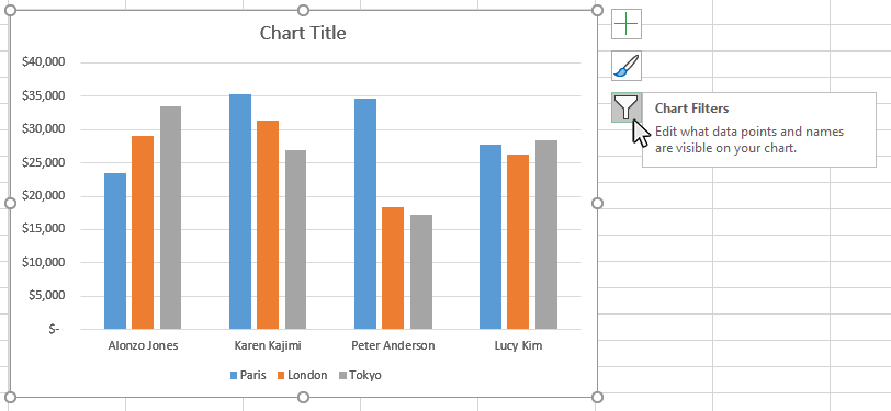
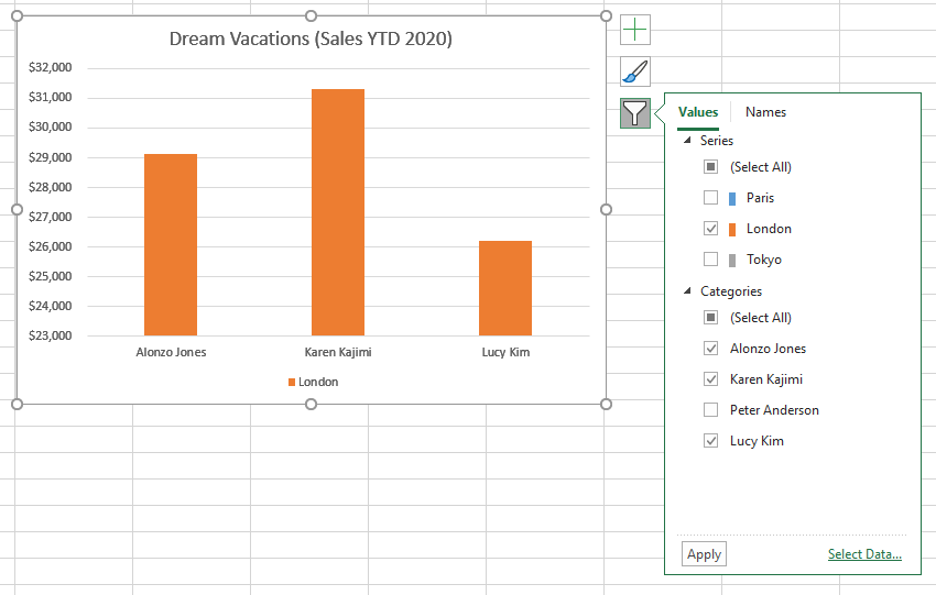
Step 3: Select the data you want to appear in the Chart Filters window
Once you have opened the Chart Filters window, you will see a number of items you can select or deselect to filter your chart data. Once you have made your changes, click the Apply button and your changes will appear on the chart.
How to Make Trendlines in Excel Charts
When creating a chart in Excel, you may want to add a trendline to your chart to help users better visualize trends in the data over time. This tutorial will teach you how to add and format trendlines on your Excel chart and graphs.
Trendlines are available for the following chart types:
- Area
- Bar
- Line
- Column
- Stock
- Scatter
- Bubble
Step 1: Click on a blank area of the chart
Use the cursor to click on a blank area on your chart. Make sure to click on a blank area in the chart. The border around the entire chart will become highlighted. Once you see the border appear around the chart, then you know it is ready to be changed.
Step 2: Click on the Chart Elements button next to the chart
Once the chart name area is highlighted, you will see the Chart Elements button next to upper right hand side of the chart. The button looks like a plus sign. Doing this will open the Chart Elements window.
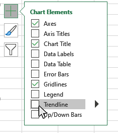
Step 3: Select Trendline from the Chart Elements window
Once you have opened the Chart Elements window, you will see a number of items you can select to add to your chart. Check the Trendline option on the Chart Elemnts window and a Trendline will appear on your chart. You can click on the arrow next to the Trendline for some additional placement options for the Trendline.
Step 4: Select Trendline Type from the Chart Elements window
Once you have turned on the Trendline option, you can select the type of Trendline you wish to appear on the chart. Click on the arrow to the right of the Trendline checkbox on the Chart Elements window and you will see options for the Trendline types on the chart.
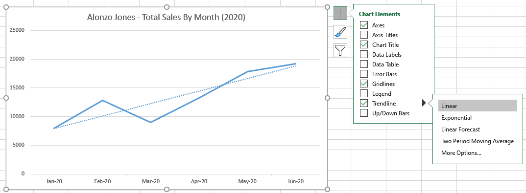
There are additional trendline types available by clicking the "More Options" button, which will give you access to the Format Trendlines panel. The Trendline Types available are:
- Exponential
- Linear
- Logarithmic
- Linear Forecast
- Moving Average
- Polynomial
- Power
- Line
- Shadow
- Glow
- Soft Edges
- Trendline Type
- Trendline Forecasting Options
- Calibration for Polynomial
- Calibration for Moving Average
- Set Intercept Option
- Display Equation
- Display R-squared Value
Step 5: Format your Chart Trendline Appearance
You can open the Format Trendline panel to access a number of formatting options for your chart Trendline. Click on the arrow to the right of the Trendline checkbox on the Chart Elements window and you will see the "More Options" button. Click on this button and the Format Trendline panel will appear.
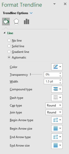
This is a list of some of the Trendline formatting options available on the Format Trendline panel:
Step 6: Format your Trendline Options
You can open the Format Trendline panel to access a additional formatting and forecasting options for your chart Trendline. Click on the arrow to the right of the Trendline checkbox on the Chart Elements window and you will see the "More Options" button. Click on this button and the Format Trendline panel will appear. Then select the Trendline Options button to display the Trendline Options menu
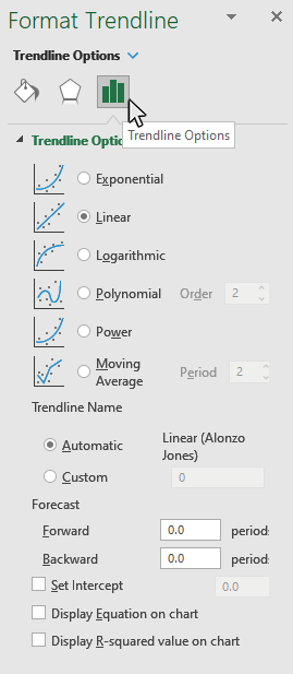
This is a list of some of the Trendline options available on the Format Trendline (Trendline Options) panel:
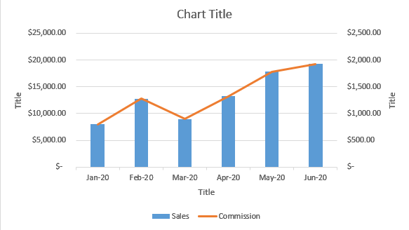
How to Make Dual Axis Charts in Excel
When creating a chart in Excel, you will sometimes want to show two different types of data on the same chart. You can accomplish this by creating a Dual Axis chart, also known as a Combo chart. This tutorial will teach you how make and format Dual Axis charts in Excel.
Step 1: Select your chart data
Use your mouse to select the data you would like to include in your chart.
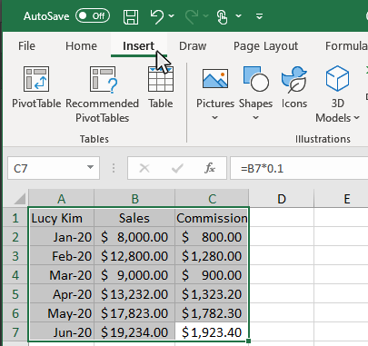
Step 2: Click the Insert Tab
Once the chart data is selected, click in the Insert tab to display insert Chart options on the ribbon.
Step 3: Mouse Over the Insert Combo Chart Button and click the down arrow
In the Chart section of the Insert tab, move you mouse over the Insert Combo Chart button, then click the down arrow to display the sub-menu.
Step 4: Select Create Custom Combo Chart button
From the Insert Combo Chart sub-menu, click the Create Custom Combo Chart button to open up the customization window for the Combo Chart.
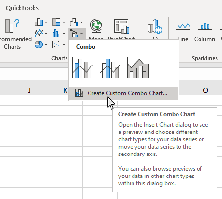
Step 5: Select the type of Combo Chart you want to use
In the Insert Combo chart Menu, select the type of Combo Chart you want to use.
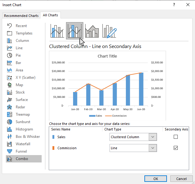
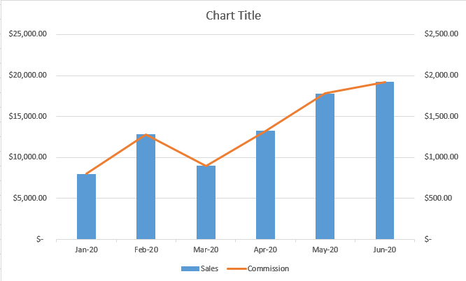
Once you have selected the appropriate option, click OK and your Dual-Axis combo chart will appear.
Step 6: Add Axis Titles to your Combo Chart
Once you have created your Combo chart, click the chart in a blank area, then click the Chart Elements button, and check the Axis Titles option. This will display title fields for each chart axis. If you triple click on the chart axis it will let you type in a new value for the axis name.
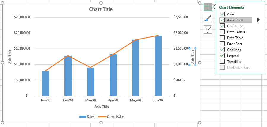
Step 7: Edit Axis Titles on your Combo Chart
If you triple-click on the chart axis text box it will let you type in a new value for the axis name.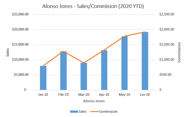
How to Create Chart Templates in Excel
When creating a chart or graph in Excel, you will sometimes want to create a template of the chart you made so you can reuse it in the future. Chart templates are an excellent way to save time, and create consistent projects, when working with Excel charts and graphs.
-->How to Create a Chart Template
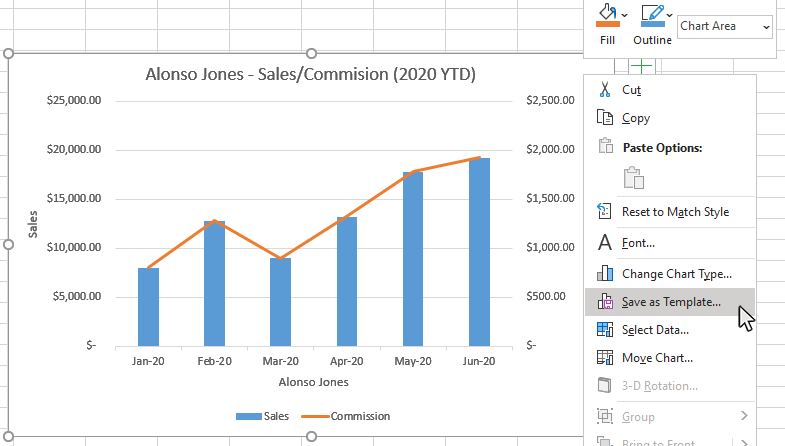
Step 1: Select the Chart you want use to create the template
Use the cursor to click on a blank area on your chart. Make sure to click on a blank area in the chart. The border around the entire chart will become highlighted. Once you see the border appear around the chart, then you know it is ready to be changed.
Step 2: Right Click, and select Save As Template option
Right Click on your selected chart and select the Save As Template option, this will open a dialog box where you can name your new template.
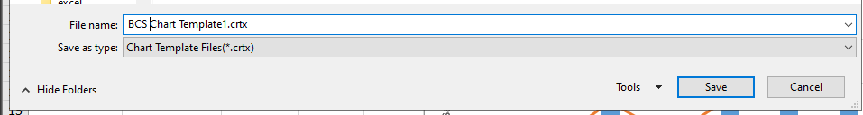
Step 3: Name the template
In the dialog box that appears, type in a name for the template and click the Save button. That is it. Now you have an Excel Chart Template that you can use for future charts. In the next section, we will look at how to apply a custom chart template to a new set of data.
How to Apply a Chart Template
Step 1: Select your chart data
Use your mouse to select the data you would like to include in your chart.
Step 2: Click the Insert Tab
Once the chart data is selected, click in the Insert tab to display insert Chart options on the ribbon.
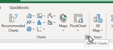
Step 3: Click on the See All Charts button
In the Chart section of the Insert tab, move you mouse to the bottom right corner, then click the See All Charts button.
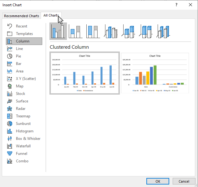
Step 4: Click on the All Charts tab in the Insert Chart window
In the Insert Chart window, click on the All Charts tab.
Step 5: Click on the Templates option on the All Charts tab
In the Chart section of the Insert tab, move you mouse to the bottom right corner, then click the See All Charts button.
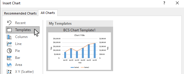
Step 6: Select the custom template you want to use, and click OK
Pick the template you want to use from the templates screen and click OK.
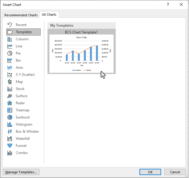
Excel will then apply the template formatting to the new chart.
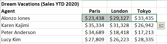
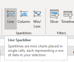
How to Create Sparklines in Excel
When working with data in Excel, you will sometimes want to create a sparklines to view a mini Sparkline within a single cell near your sourece data. Sparklines are a nice tool to provide quick snapshots of data trends without creating a Sparkline or graph in Excel.
Step 1: Select the data you want in the Sparkline
Use your mouse to select the data you would like to include in your sparkline.
Step 2: Click the Insert Tab
Once the data is selected, click in the Insert tab to display the Sparkline options on the ribbon.
Step 3: Click on one of the Sparkline types
In the Sparkline section of the Insert tab, click on one of the Sparkline types displayed.
Step 4: Select the Cell for the Sparkline to appear
After you select the sparkline type, a window will appear and ask you for the location where the sparkline should be placed. Click your mouse inside the box for Location Range, and then click the cell where you want the sparkline to appear. The cell reference for the selected cell will appear in the Location Range box.
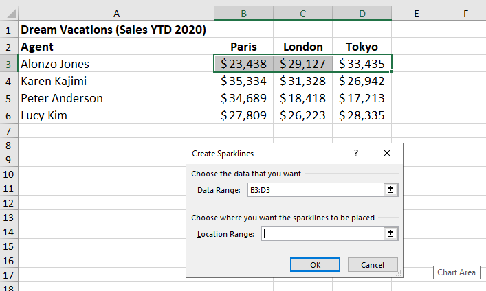
The cell reference for the selected cell will appear in the Location Range box.
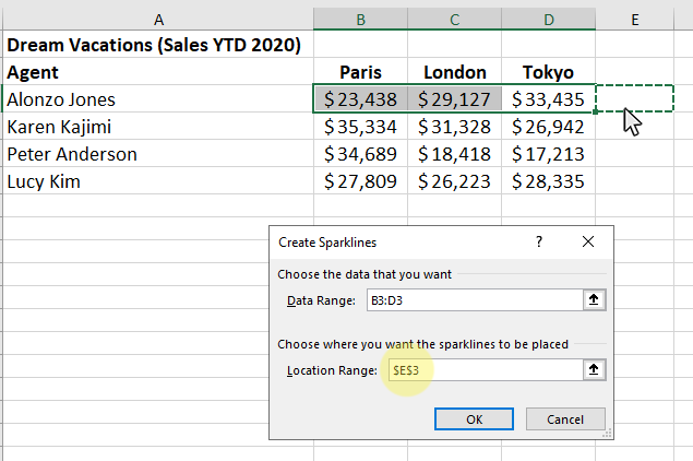
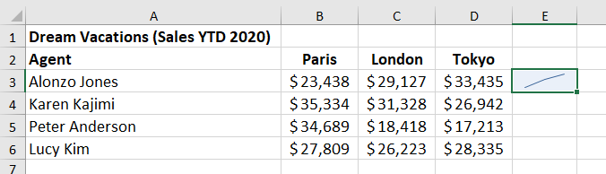
Step 5: Click OK, and the sparkline will appear in the selected cell
After you have selected the cell location for the sparkline, just click ok and the sparkline will appear.
Thanks for checking out this tutorial. If you need additional help, you can check out some of our other free Excel Chart tutorials, or consider taking an Excel class with one of our professional trainers, or with one of our self-paced courses.