


How to Make Trendlines in Excel Charts
When creating a chart in Excel, you may want to add a trendline to your chart to help users better visualize trends in the data over time. This tutorial will teach you how to add and format trendlines on your Excel chart and graphs.
Trendlines are available for the following chart types:
- Area
- Bar
- Line
- Column
- Stock
- Scatter
- Bubble
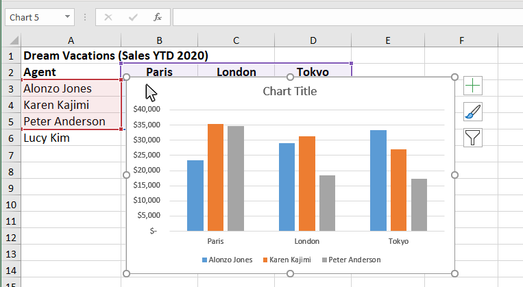
Step 1: Click on a blank area of the chart
Use the cursor to click on a blank area on your chart. Make sure to click on a blank area in the chart. The border around the entire chart will become highlighted. Once you see the border appear around the chart, then you know it is ready to be changed.
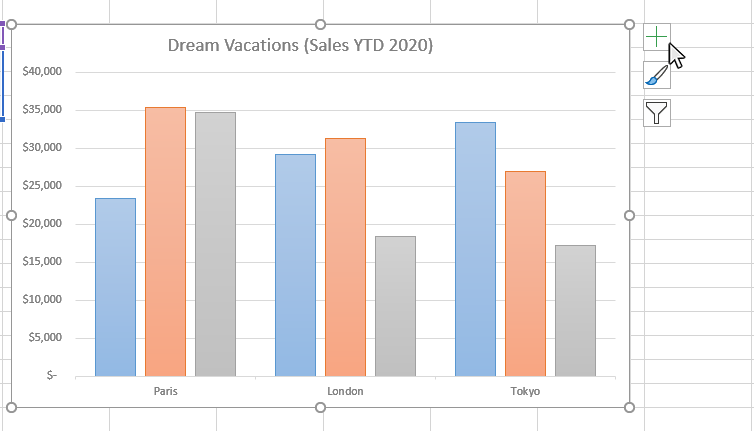
Step 2: Click on the Chart Elements button next to the chart
Once the chart name area is highlighted, you will see the Chart Elements button next to upper right hand side of the chart. The button looks like a plus sign. Doing this will open the Chart Elements window.
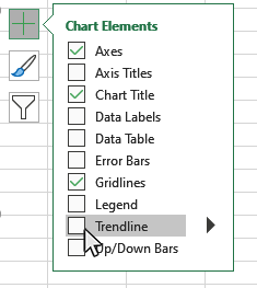
Step 3: Select Trendline from the Chart Elements window
Once you have opened the Chart Elements window, you will see a number of items you can select to add to your chart. Check the Trendline option on the Chart Elemnts window and a Trendline will appear on your chart. You can click on the arrow next to the Trendline for some additional placement options for the Trendline.
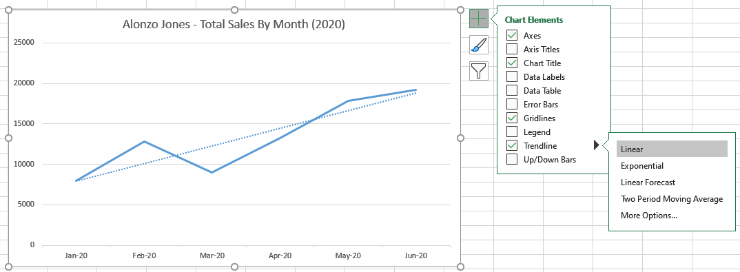
Step 4: Select Trendline Type from the Chart Elements window
Once you have turned on the Trendline option, you can select the type of Trendline you wish to appear on the chart. Click on the arrow to the right of the Trendline checkbox on the Chart Elements window and you will see options for the Trendline types on the chart.
There are additional trendline types available by clicking the "More Options" button, which will give you access to the Format Trendlines panel. The Trendline Types available are:
- Exponential
- Linear
- Logarithmic
- Linear Forecast
- Moving Average
- Polynomial
- Power
- Line
- Shadow
- Glow
- Soft Edges
- Trendline Type
- Trendline Forecasting Options
- Calibration for Polynomial
- Calibration for Moving Average
- Set Intercept Option
- Display Equation
- Display R-squared Value
Step 5: Format your Chart Trendline Appearance
You can open the Format Trendline panel to access a number of formatting options for your chart Trendline. Click on the arrow to the right of the Trendline checkbox on the Chart Elements window and you will see the "More Options" button. Click on this button and the Format Trendline panel will appear.
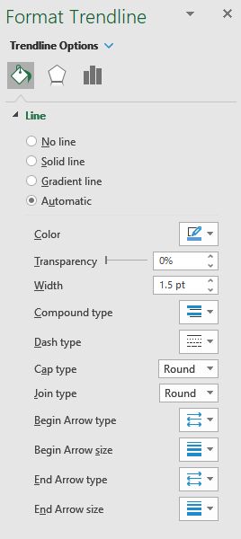
This is a list of some of the Trendline formatting options available on the Format Trendline panel:
Step 6: Format your Trendline Options
You can open the Format Trendline panel to access a additional formatting and forecasting options for your chart Trendline. Click on the arrow to the right of the Trendline checkbox on the Chart Elements window and you will see the "More Options" button. Click on this button and the Format Trendline panel will appear. Then select the Trendline Options button to display the Trendline Options menu
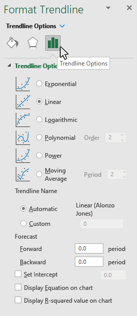
This is a list of some of the Trendline options available on the Format Trendline (Trendline Options) panel:
Topic #12
How to Make Dual Axis Charts in Excel
Thanks for checking out this tutorial. If you need additional help, you can check out some of our other free Excel Chart tutorials, or consider taking an Excel class with one of our professional trainers.