


Creating Chart or Graphs in Google Sheets is one of the key topics many of our students want to learn how to do. Being able to create insightful visuals based on your business data is an essential skillset for many Google Sheets users. We decided to put together a complete set of tutorials from excerpts of our Google Sheets Charts, Formatting and Reporting class and offer it to you at no charge.
The lessons are pulled straight from our live instructor Google Sheets courses, and are the same topics we cover during our live classes.
Once, you learn the basics about creating charts in Google Sheets, you will be able to use your spreadsheet data to visually communicate business trends and information to your team and to clients. When presented effectively, charts can be an extremely powerful tool when analyzing your business data.
This ultimate guide to Google Sheets Charts and Graphs is set up so you can learn how to create, edit and publish charts in step-by-step format. Students can go through the lessons in order, or hop to a topic that you want to focus on. There are practice files mentioned in most of the training videos that can be downloaded here.
This is a core skill in Google Sheets, and once you learn it, you will be glad you did. So, let’s get started…
If you use Excel instead of Google Sheets check out our Ultimate Guide To Excel Charts and Graphs.
Chart Building - Key Steps
The guide will show you all the key steps required to build a Chart in Google Sheets.
If you have never built a chart or graph in Google Sheets, this is the place you will want to start.
The main steps in creating an Google Sheets Chart are:
- Selecting Data for your Chart
- Select Your Chart Type
- Edit your Chart Design
- Edit your Chart Formatting
- Exporting your Chart
Click here to view the full tutorial on Google Sheets Chart Building Basics
Selecting Data for your Chart
When starting to build a graph in Google Sheets the first thing you want to do is to identify what information you want to include in your chart.
Charts can compare two or more sets of data from your Google Sheets spreadsheet, depending on the information you would like to communicate within your chart.
Once you have identified your data points, you can select that data to include in your chart. After the data is selected, you can move on to the next step and select your chart type.
Selecting the Right Chart Type
Google Sheets offers a wide variety of Chart Types for you to use to display your information.
You can communicate how you present your data differently, depending on the chart type that you use.
Topics covered will include:
- Changing the Chart Type from the Ribbon
- Changing the Chart Type from the Right Click Menu
Click here to view the full tutorial on How to Change the Chart Type In Google Sheets
Available Chart Types In Google Sheets
Google Sheets currently offers 17 different chart types available to use.
Each chart type has a specific look and purpose.
We have tutorials available on each of these different chart types for you explore:
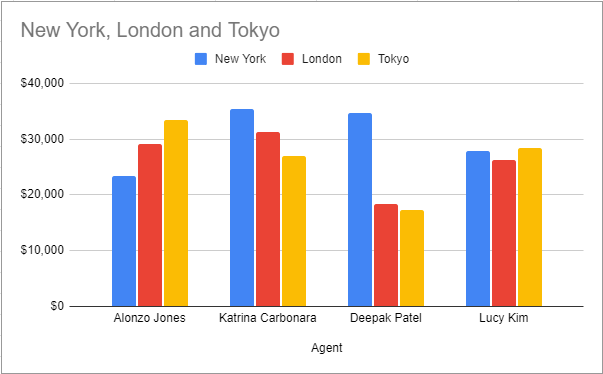
Clustered Column Chart
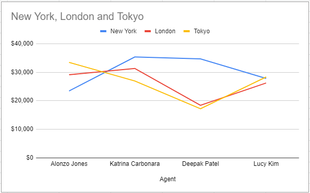
Line Graph
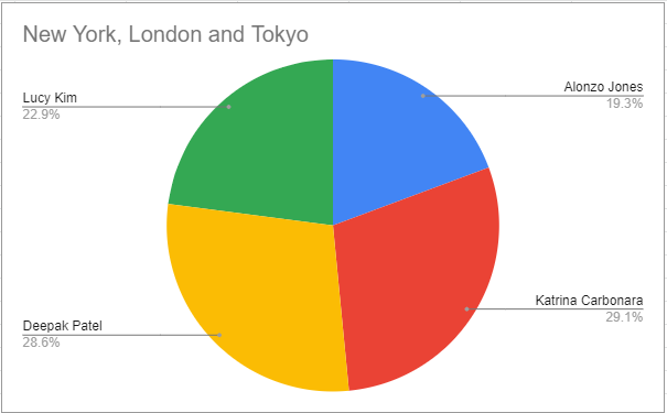
Pie Chart
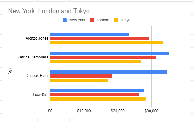
Clustered Bar Chart
Area Chart
Scatter Chart
Bubble Chart
A clustered column chart, or column chart, is used to display a series of two or more data sets in vertical clustered columns. The vertical columns are grouped together, because each data set shares the same axis labels. Clustered Columns are beneficial in directly comparing data sets.
A Line Graph, or line chart, is used to display trends in data over time, by connecting data points using straight lines. Line graphs can compare data over time for one or more groups, and can be used to measure changes over long or short periods of time.
A Pie chart, or Pie Graphs, are used to display information as a percentage of a whole. The the entire Pie represents 100% of the value you are measuring and the data points are a piece, or percentage of that pie. Pies charts are beneficial when visualizing how much each data point contributes to the entire data set.
A clustered Bar chart, or Bar chart, is used to display a series of two or more data sets in horizontal clustered Bars. The horizontal bars are grouped together, because each data set shares the same axis labels. Clustered Bars are beneficial in directly comparing data sets.
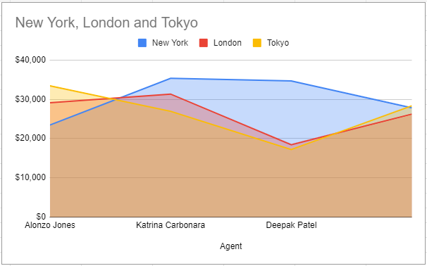
An Area chart, or area graph, is line chart with the area filled in below each line with a color code for each data set.
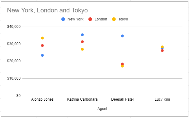
A Scatter chart, or Scatter Plot, is used to display two or more sets of data to look for correlation and trends between the sets of data values. Scatters plots are useful in identifying trends in data sets, and establishing the strength of correlation between values in those data sets.
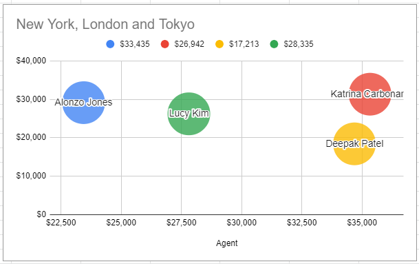
A Bubble chart, or column chart, is used to display a series of two or more data sets in vertical Bubbles. The vertical columns are grouped together, because each data set shares the same axis labels. Bubbles are beneficial in directly comparing data sets.
Click here to view the full tutorial on What Types of Chart Does Google Sheets Offer?
Formatting the Appearace of your Chart
Google Sheets offers a number of options for you to customize the appearance of your chart.
You have a great degree of flixibilty in editing the appearance of your chart to make it visually appealing and to communicate your data effectively.
Topics covered will include:
- Positioning the Chart on the Worksheet
- Add a Title to a Chart
- Resizing the Chart
- Changing the Colors of Chart Elements
- Changing the Style of Chart Elements
- Changing the Chart Fonts and Font Sizes
- Add a Legend to a Chart
- Add a Gridlines to a Chart
- Add a Axis Lables to a Chart
- Creating a Reusable Chart Template
Here are links to the full tutorials on formatting the appearance of your charts:
- How to Move and Resize Charts in Google Sheets
- How to Add a Title to a Chart in Google Sheets
- How to Add a Legend to a Chart in Google Sheets
- How to Add and Remove Gridlines in Google Sheets
- How to Add Axis Labels to a Chart in Google Sheets
Formatting the Data on your Chart
Google Sheets offers a number of options for you to customize the data displayed on your chart.
The ability to manipulate the display of data on your charts will give you the flexibilty needed to communicate your data effectively.
Topics covered will include:
- Adding Data Tables
- Filtering Chart Data
- Adding Trendlines to Data
- Building Dual Axis Charts
- Creating Sparklines
Here are links to the full tutorials on formatting the appearance of your charts:
- How to Make Data Tables in Google Sheets
- How to Filter Charts in Google Sheets
- How to Make Trendlines in Google Sheets Charts
- How to Make Dual Axis Charts in Google Sheets
- How to Create Sparklines in Google Sheets
Exporting your Chart
Now that you have completed your chart, you may want to export it to a different document or print the chart.
We will look a the various options for exporting your Google Sheets charts.
Topics covered will include:
- Saving a Chart as an Image
- Saving a Chart as a PDF
- Inserting and Google Sheets Chart into Google Docs
- Inserting and Google Sheets Chart into Google Slides
Here are links to the full tutorials on formatting the appearance of your charts:
- How to Make Data Tables in Google Sheets
- How to Filter Charts in Google Sheets
- How to Make Trendlines in Google Sheets Charts
- How to Make Dual Axis Charts in Google Sheets
- How to Create Sparklines in Google Sheets
If there are any topics that you think would be useful to add to this guide, please feel free to contact us. Your feedback is always appreciated.
Topic #1
How to Make a Chart in Google Sheets