


How to Make a Scatter Chart in Google Sheets
A Scatter chart, or Scatter Plot, is used to display two or more sets of data to look for correlation and trends between the sets of data values. Scatters plots are useful in identifying trends in data sets, and establishing the strength of correlation between values in those data sets.
This tutorial will show you how to make and edit a Scatter Chart in Google Sheets
How to Make a Scatter Chart in Google Sheets
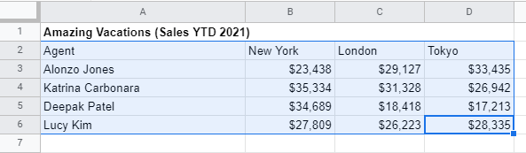
Step 1: Select the source data you want displayed in the Scatter Chart
Use your mouse to select the data you would like to include in your Scatter Chart.
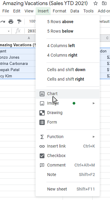
Step 2: Click the Insert option on the main menu, and then click the Chart Option from the submenu
Once the data is selected, click in the Insert option from the main menu. Then slect Chart from the submenu that appears.
Once you select the Chart option, a chart will appear on the worksheet and the Chart Editor panel will appear on the right side of the worksheet. The chart type will default to the chart type that Sheets recommends for the data set selected.
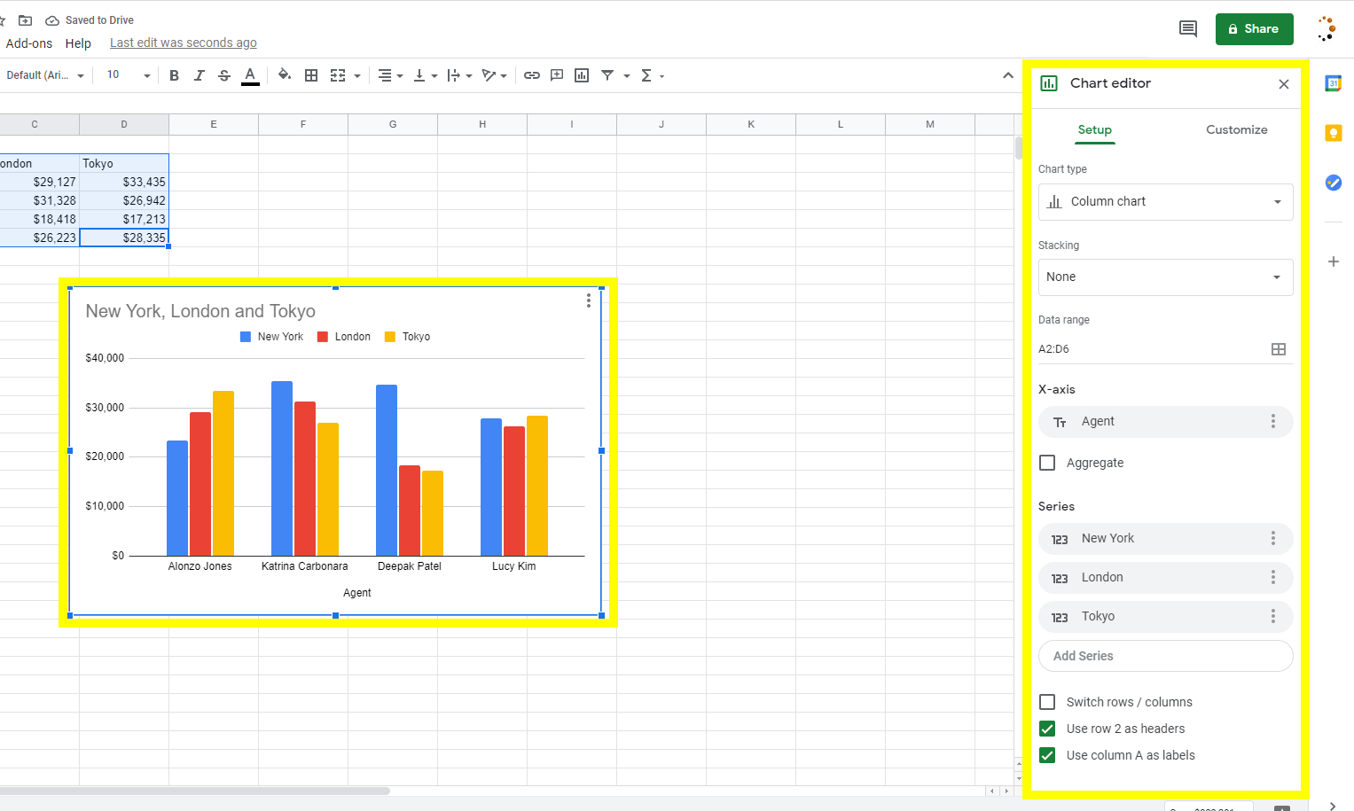
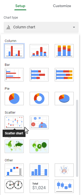
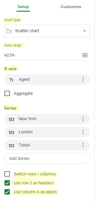
Step 3: Change the Chart type to Scatter Chart.
Click the Scatter Chart button from the Chart Editor - Setup Tab, then the chart will appear in the workbook.
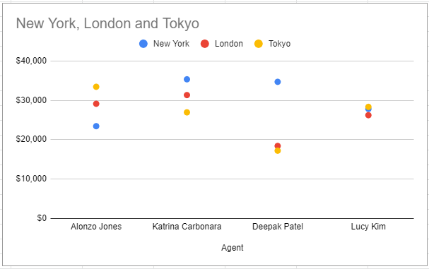
Result: Your Scatter Chart will appear on your worksheet
You will now see your Scatter Chart appear in your worksheet. Now you can start adding chart elements and formatting to your chart. Continue reading for more details on adding chart elements and chart formatting.
Set Chart Options from the Setup tab on the Chart Editor panel
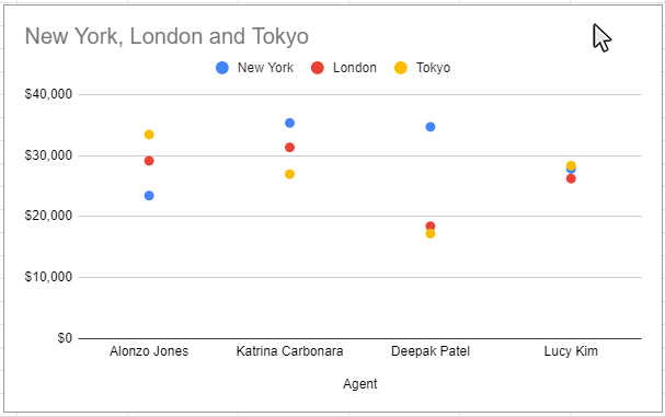
Step 1: Double-Click on a blank Scatter of the chart to open the Chart Editor Panel
Use the cursor to double-click on a blank Scatter on your chart. Doing this will open the Chart Editor panel.Make sure to click on a blank Scatter in the chart. The border around the entire chart will become highlighted. Once you see the Chart Editor panel appear on the right side of the worksheet, then you know the chart setup and customization features are accessible.
Step 2: Click on the Setup tab on the Chart Editor panel
Once the Chart Editor panel is visible, click the Setup tab to access the chart setup options.
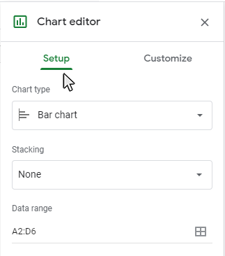
Step 3: Adjust the Setup Options you would like to modify on the Setup tab
Google Sheets has a number of Setup Options available to configure the data elements on your chart or graph.
Here is a list of available Setup options for Scatter Charts:
- Chart Type
- Data Range
- X-Axis
- Series
- Switch Rows/Columns
- Use Row as Header
- Use Column as Label
Each of these chart setup options can be formatted in a variety of ways. See the individual feature for available adjustments that can be made.
Customize the Scatter Chart using the Customize tab on the Chart Editor panel.
Step 1: Double-Click on a blank Scatter of the chart to open the Chart Editor Panel
Use the cursor to double-click on a blank Scatter on your chart. Doing this will open the Chart Editor panel.Make sure to click on a blank Scatter in the chart. The border around the entire chart will become highlighted. Once you see the Chart Editor panel appear on the right side of the worksheet, then you know the chart setup and customization features are accessible.
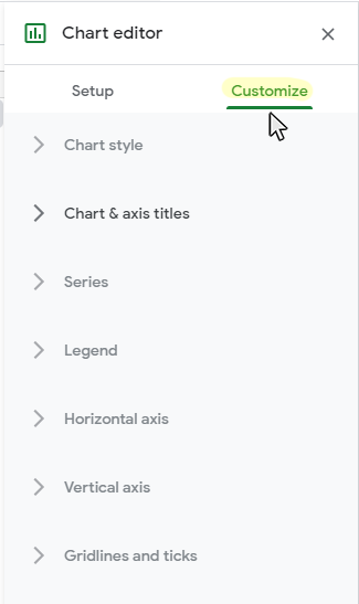
Step 2: Click on the Customization tab on the Chart Editor panel
Once the Chart Editor panel is visible, click the Customization tab to access the chart customization options.
Step 3: Adjust the Customization Options you would like to modify on the Customization tab
Google Sheets has a number of customization options available to configure the visual display elements on your Scatter Chart or graph.
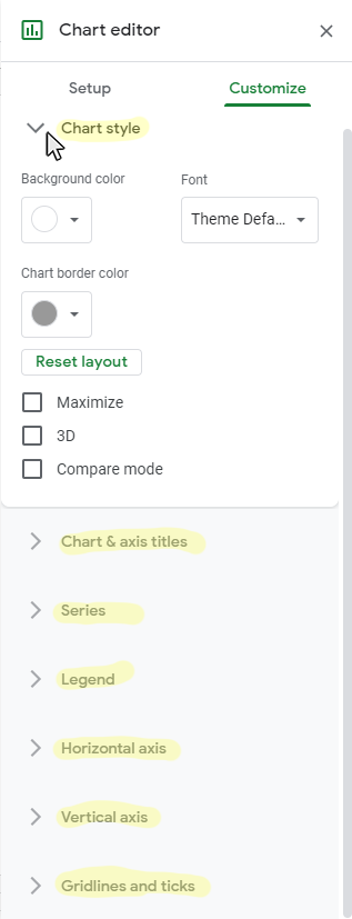
Click the arrow for the option sub-menu that you would like to edit.
Here is a list of available Customization options for Scatter Charts:
- Chart Style
- Background Color
- Font
- Chart Border Color
- Reset Layout
- Maximize
- 3D
- Chart and Axis Titles
- Title Type Selector
- Title Text
- Title Font
- Title Font Size
- Title Format
- Title Text Color
- Series
- Series Selector
- Type
- Fill Color
- Fill Opacity
- Line Color
- Line Opacity
- Line Dash Type
- Line Thickness
- Axis
- Format Data Point
- Legend
- Position
- Legend Font
- Legend Font Size
- Legend Format
- Text color
- Horizontal Axis
- Label Font
- Label Font Size
- Label Format
- Text Color
- Reverse Axis Order
- Slant Labels
- Vertical Axis
- Label Font
- Label Font Size
- Label Format
- Text Color
- Show Axis Line
- Minimum Value
- Maximum Value
- Scale Factor
- Log Scale
- Number Format
- Gridlines and Ticks
- Gridline Axis Selector
- Major Spacing Type
- Major Count
- Minor Spcaing Type
- Minor Count
- Major Gridlines
- Gridline Color
- Minor Gridlines
- Major Ticks
- Minor Ticks
Each of these chart elements can be formatted in a variety of ways. Please see our other tutorials on how to add and format each chart element.
Next Topic
How to Make a Filled Map Chart in Google Sheets
Thanks for checking out this tutorial. If you need additional help, you can check out some of our other free Google Sheets Chart Tutorials, or consider taking an Google Sheets class with one of our professional trainers.