


How to Add Axis Labels to a Chart in Google Sheets
When creating a chart in Google Sheets, you may want to add a axis labels to your chart so the users can undertand the information contained in the chart. This tutorial will teach you how to add and format Axis Lables to your Google Sheets chart.
Step 1: Double-Click on a blank area of the chart
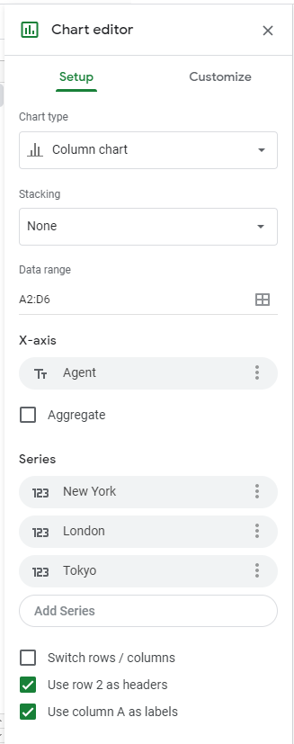
Use the cursor to double-click on a blank area on your chart. Make sure to click on a blank area in the chart. The border around the entire chart will become highlighted, and the Chart Editor Panel will appear on the right side of the page.
The Chart Editor Panel is where you will make changes to the chart title.
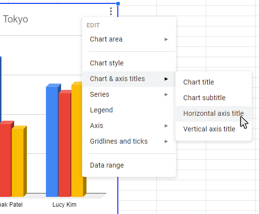
Alternate method: Here is another way to get to the Chart Editor panel. When a blank area of the chart is selected, right click the mouse and Edit menu will appear. You can then select the Chart Style button and the Chart Editor panel will appear.
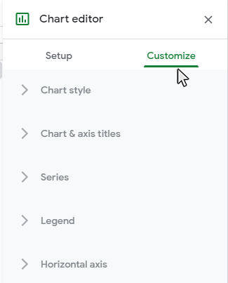
Step 2: Select the Customize tab
After you have selected your chart, the Chart panel will appear on the right side of the page. Select the Customize tab, and then the options to edit the chart style will appear.
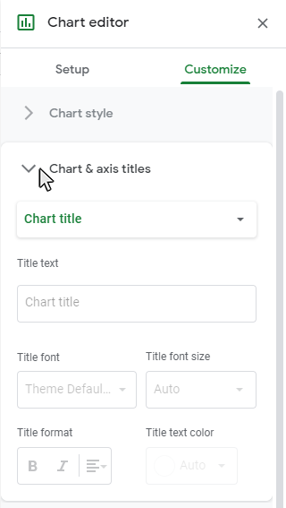
Step 3: Open the Chart and Axis Titles sub-menu
Click on the Chart and Axis Titles sub-menu on the Customize tab and you wil see the available title options for the chart type you have selected.
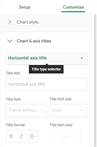
Step 4: Select the Horizontal or Vertical axis from the dropdown menu
Click on the Chart and Axis Titles sub-menu on the Customize tab and you wil see the available title options for the chart type you have selected.
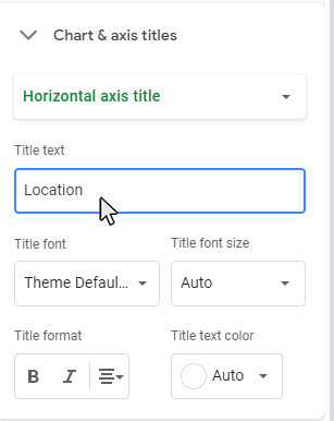
Step 5: Type in the Axis Title Name
Type in the Axis Title you want in the Title Text dialog box.
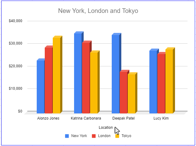
Result: The chart style will be updated with a title
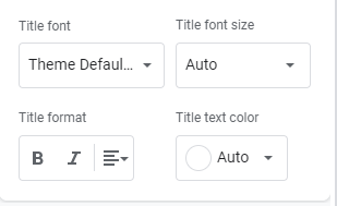
Step 5: How to Format the Axis Title
There are a number of options to format your axis titles. Axis Title formatting options are listed on the Chart and Axis Titles sub-menu. You are able to format your axis title in the following ways:
- Title Font
- Title Font Size
- Title Format (Bold, Italics, and Alignment)
- Title Text Color
Topic #10
How to Make Trendlines in Google Sheets Charts
Thanks for checking out this tutorial. If you need additional help, you can check out some of our other free Google Sheets Chart tutorials, or consider taking an Google Sheets class with one of our professional trainers.